How To Use Typography Responsiveness Settings
Your OceanWP theme allows you to apply responsiveness settings to Typography.
This means that you can set different font size, line height and letter spacing individually for each device (computer, tablet and mobile).
In this article will show you how to use and apply OceanWP typography responsiveness settings.
1 Default Typography Settings
Default typography settings are always set for PC as the main device.
2 Display Typography Responsiveness Settings
Next to each setting (not just typography) which offers additional responsiveness settings you will see a little icon.

Click the computer icon to display additional responsiveness settings.
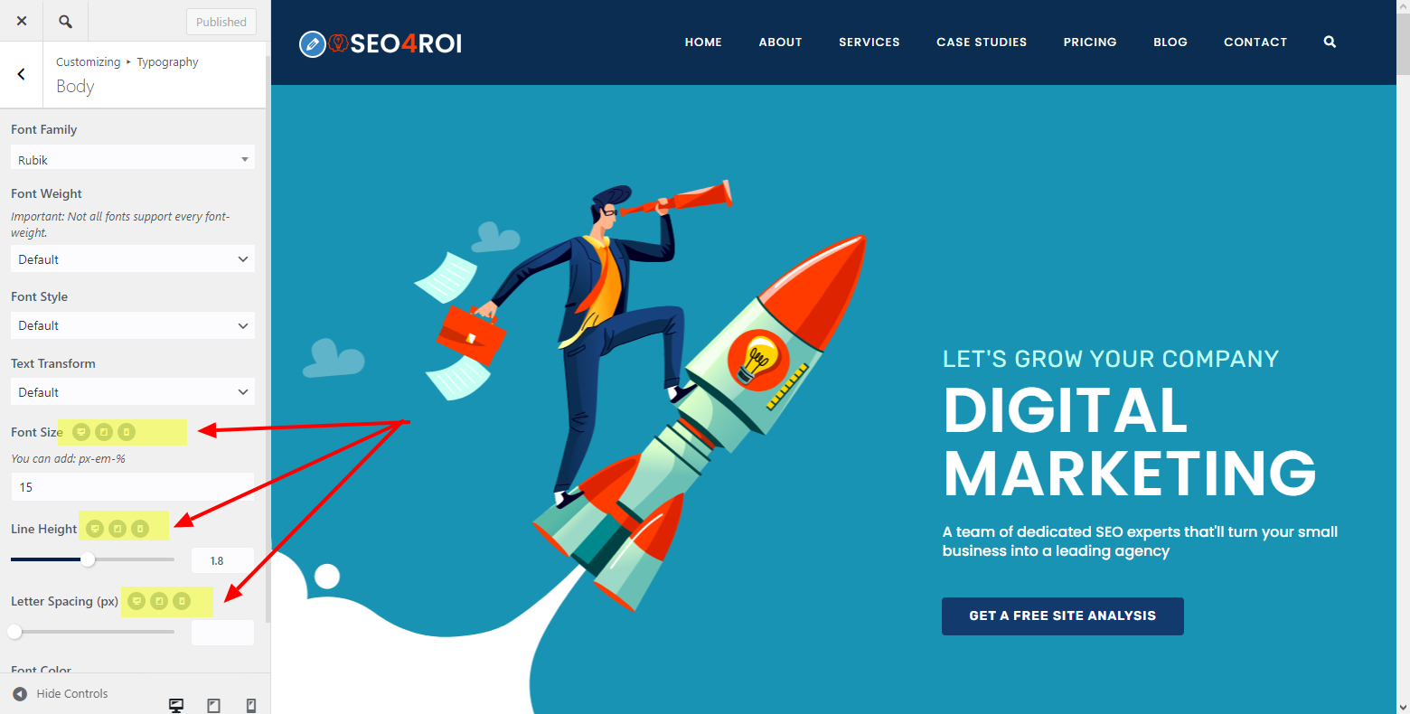
3 Choose the Device
Click on the icon of the device you wish to apply different settings for. For example, the tablet, which is the middle icon.

4 Add Values
Add values for the device you have selected.
For some settings, like for the Font Size, you will also need to add the measurement unit as well. Example, 15px or 1em.
In the example image below, our website will use 15px for the body text when previewed from a PC, but use 14px font size instead when previewed from a tablet.

5 Repeat the Process
Repeat the process for all devices and settings you wish to change, then publish changes.

That's it!
Happy website building