How To Use Swatches Customizer Styling
The Swatches Customizer Styling module is available to you as of v 1.1.0 of Ocean eComm Treasure Box addon for custom WooCommerce websites.
If you have variable products in your online store, but not making use of custom templates either in full or just partially (for example, you are using a custom template for the single product but default OceanWP WooCommerce pages for Shop and Product Archives), you can still style the product swatches as you please.
Before applying custom styles, learn how to use Product Swatches module and create different product swatches types.
Enable the Swatches Customizer Styling Feature
To style product swatches on pages that are utilizing default WooCommerce pages with OceanWP (aka not utilizing custom templates for Shop, single product, etc) you need to enable the Swatches Customizer Styling feature.
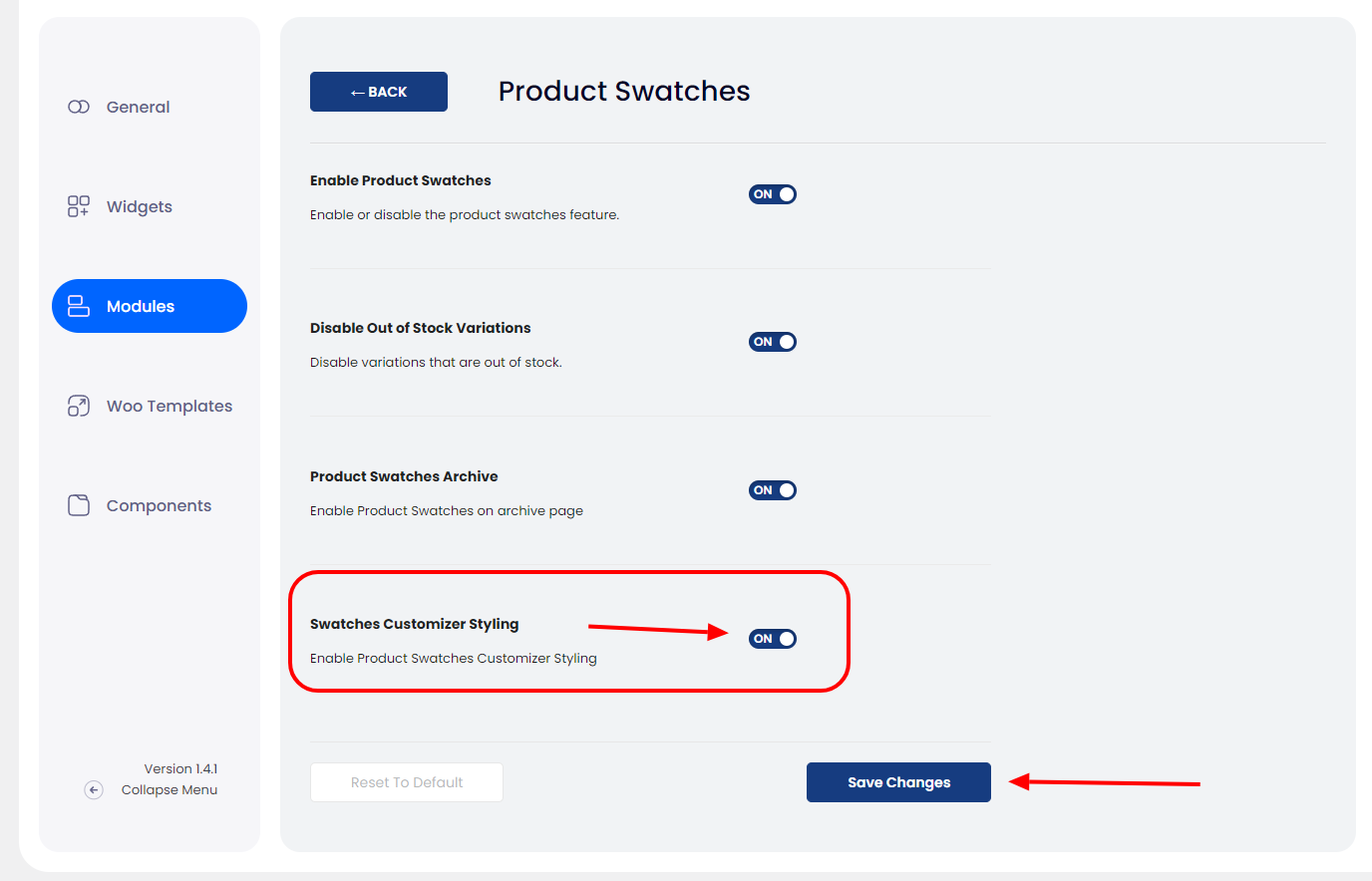
Navigate to your eCommerce OTB dashboard, section Modules:
- click the cog icon next to Product Swatches,
- toggle the button next to the Swatches Customizer Styling option,
- and Save Changes.
Product Swatches Customizer Styling Options
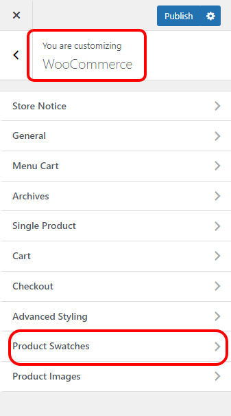
Once done, go to Customize > WooCommerce and you will see a new panel called Product Swatches.
In the Product Swatches panel, you can customize the styling for all product swatches option, both for archive and single product pages:
- Product Swatches - Single section contains options to customize the product swatches for the single product page,
- Product Swatches - Archive section contains options to customize the product swatches for the Shop and product archive (product category, product tag) pages.
Product Swatches - Single
The Product Swatches - Single section contains styling options for the display of product swatches on the default single product page.
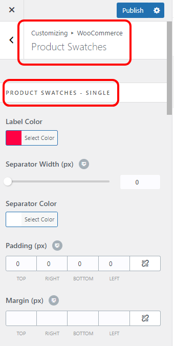
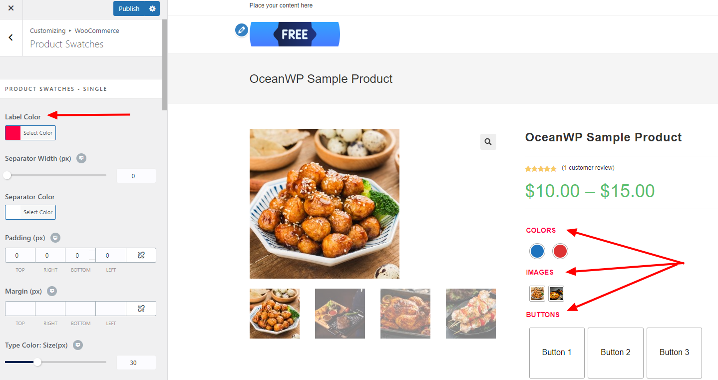
Label
The Label Color option controls the color of the name of the product variation. In our example, those names are Color and Images.
Separator
You can add a visual separator (line) between each of the variation types.
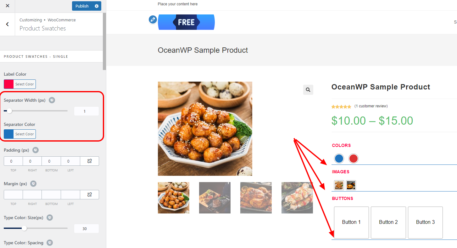
Separator Width controls the separator height (line thickness) and it also offers responsive settings to customize for multiple devices.
Separator Color controls the color of the separator (line).
Padding and Margin
Padding and Margin options allow you to to customize the surrounding area (spacing) around the display of swatches - variations.
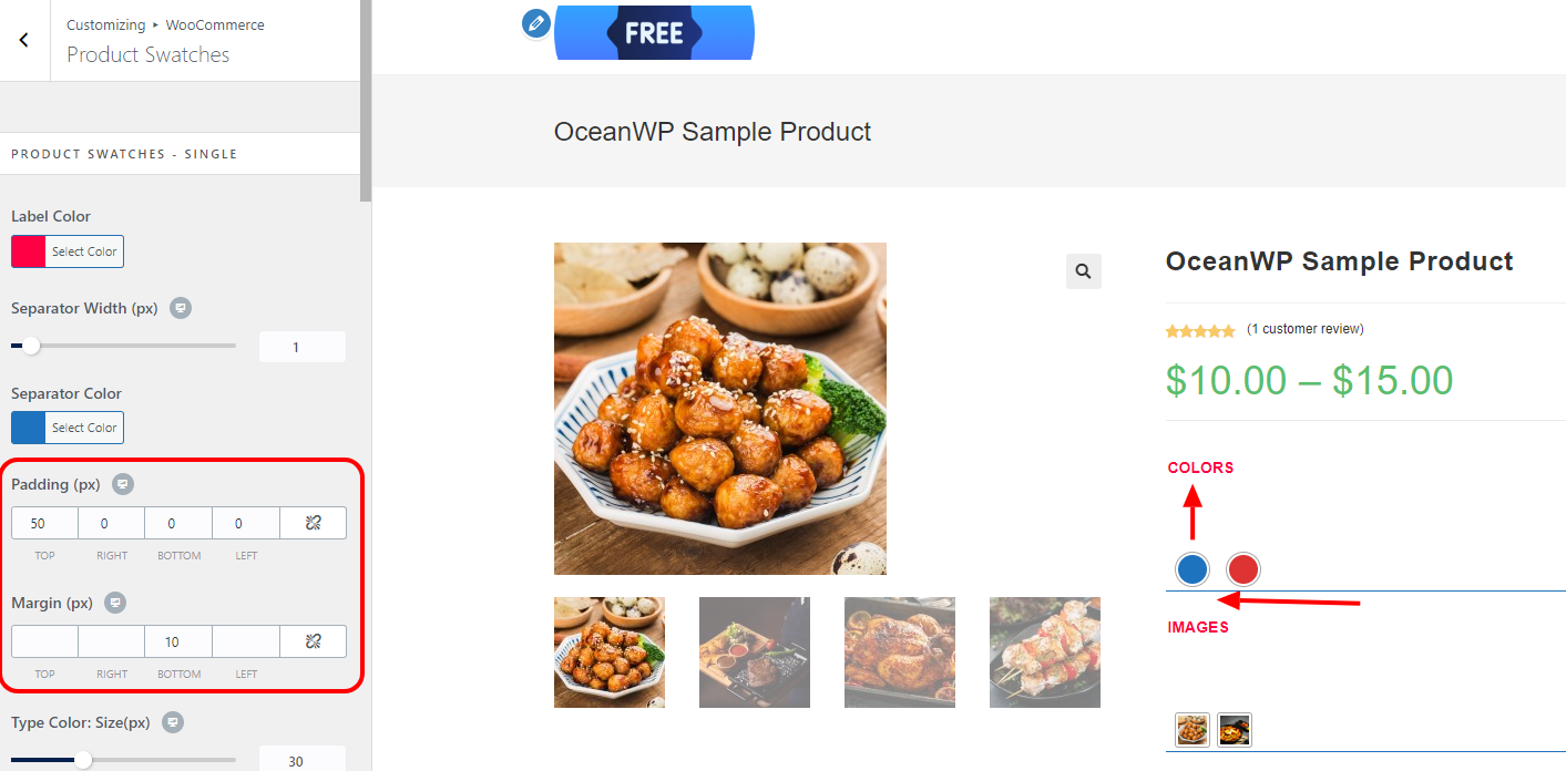
These settings are applied for each attribute (variation) independently.
Responsive settings allow you to apply independent settings for each device.
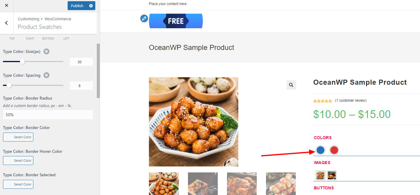
Type Color
All customization options with the settings name starting with Type Color control the styling of the Color product attribute type:
- Type Color: Size - control the size of the display of color swatches;
- Type Color: Spacing - control spacing between color type swatch items;
- Type Color: Border Radius - control the border radius for color swatch item (example, add 50% to display items as a circle);
- Type Color: Border Color - set the border color for the color swatch item;
- Type Color: Border Hover Color - set the border color for the color swatch item on hover;
- Type Color: Border Selected - set the border color for the color swatch item that has been selected.
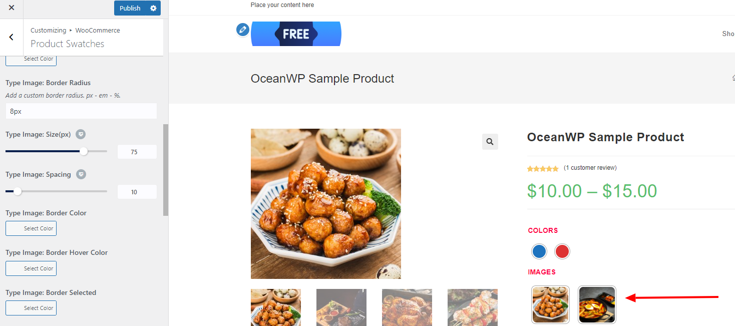
Type Image
All customization options with the settings name starting with Type Image control the styling of the Image product attribute type:
- Type Image: Border Radius - control the border radius for image swatch item (example, add 50% to display items as a circle);
- Type Image: Size - control the size of the display of image type swatches;
- Type Image: Spacing - control spacing between image type swatch items;
- Type Image: Border Color - set the border color for the image swatch item;
- Type Image: Border Hover Color - set the border color for the image swatch item on hover;
- Type Image: Border Selected - set the border color for the image swatch item that has been selected.
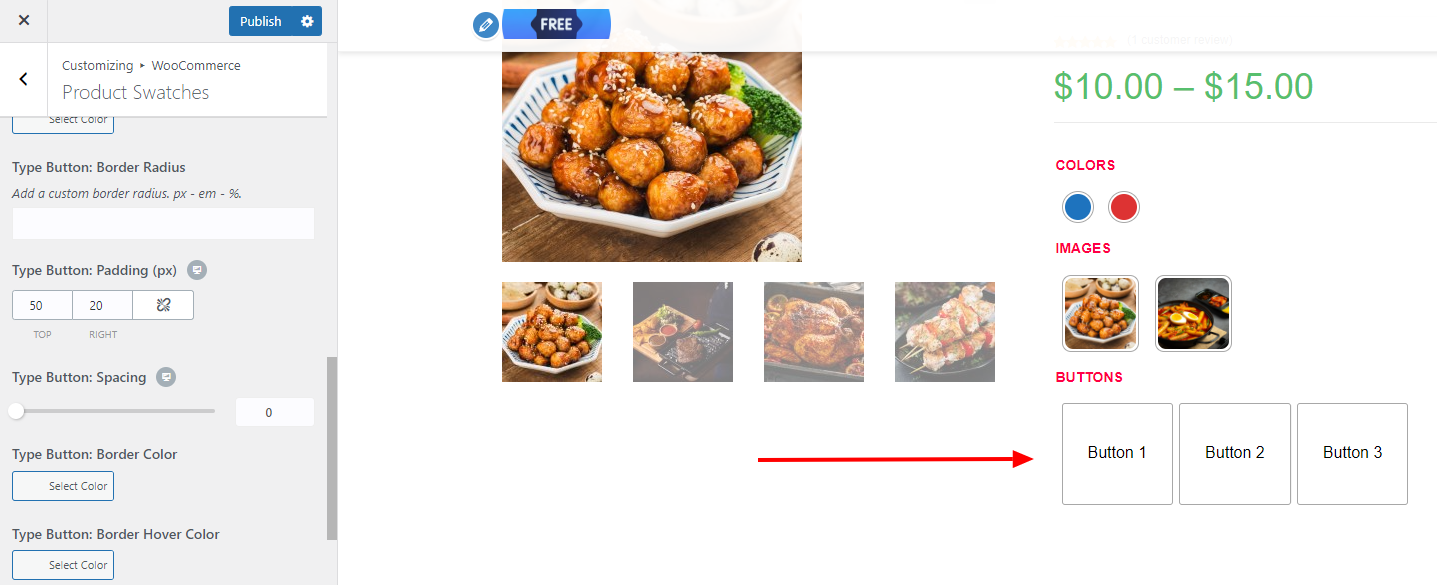
Type Button
All customization options with the settings name starting with Type Button control the styling of the Button product attribute type:
- Type Button: Border Radius - control the border radius for button swatch item;
- Type Button: Padding - control the size of the display of button type swatches: top (top and bottom), right (right and left);
- Type Button: Spacing - control spacing between button type swatch items;
- Type Button: Border Color - set the border color for the button type swatch item;
- Type Button: Border Hover Color - set the border color for the button type swatch item on hover;
- Type Button: Border Selected - set the border color for the button swatch item that has been selected.
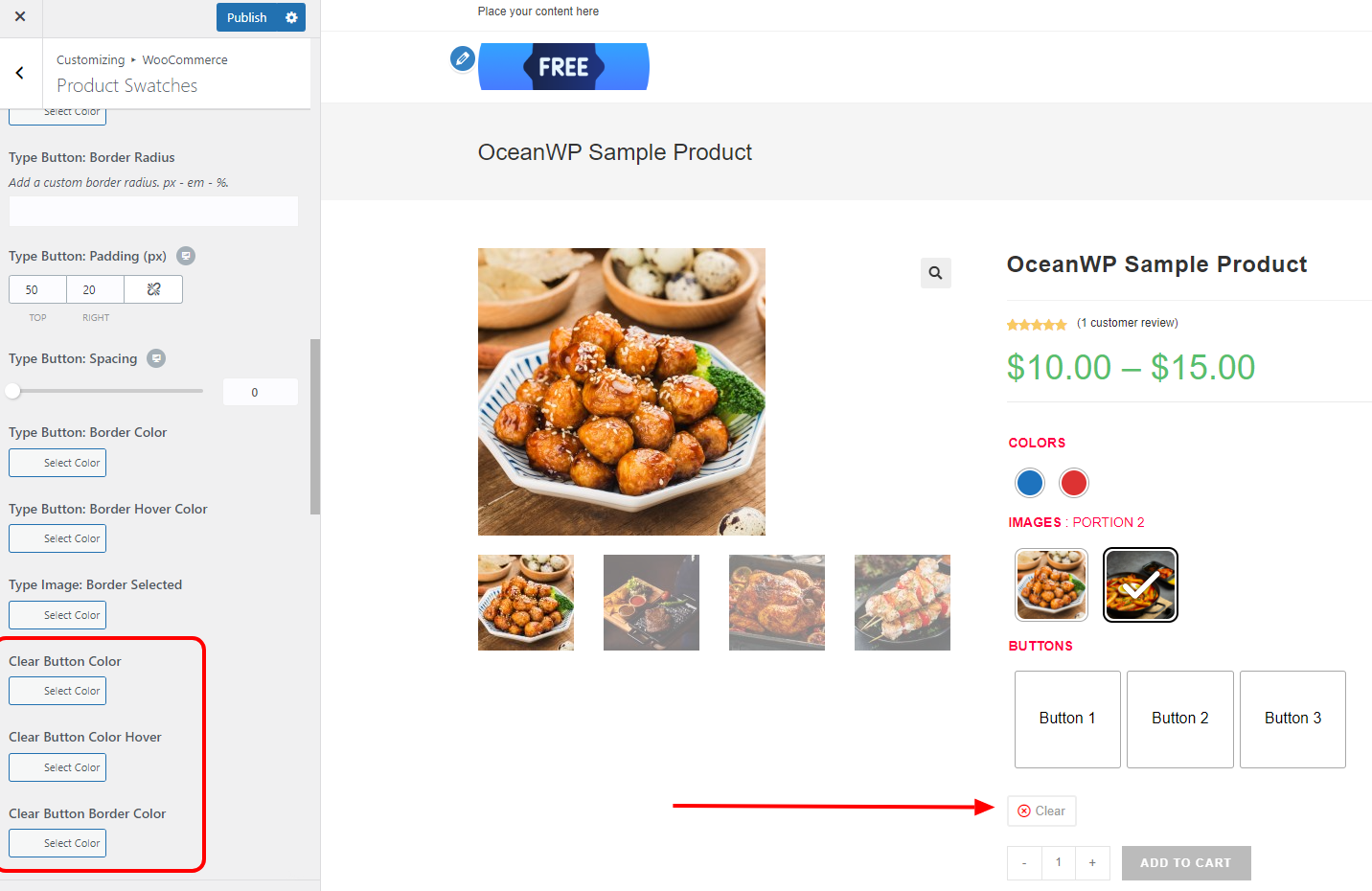
Clear Button
All customization options with the settings name starting with Clear Button control the styling of the button that serves to reset customer's swatches selection:
- Clear Button: Color - control the default color of the text on the button;
- Clear Button: Color Hover - control the button text color on hover;
- Clear Button: Border Color - control the border color of the button;
Product Swatches - Archive
The Product Swatches - Archive section contains styling options for the display of product swatches on the default Shop and product archive pages.
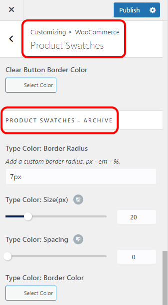
Apart from the Label, Separator, Padding and Margin settings which are not available here, all other styling options for different attribute types (Color, Image, Button) function exactly the same like for the Product Swatches - Single.
That's it!
Enjoy building your custom eCommerce website with OceanWP and Ocean eComm Treasure Box