How To Use Columns Grid Frame for Elementor
Welcome to your Ocean eComm Treasure Box!
The Columns Grid Frame feature is available as of Ocean eComm Treasure Box 1.2.0 version.
The Columns Grid Frame is a feature for the Elementor page editor (free or pro), that enables you to achieve pixel-perfect design by displaying a Figma-like (or InDesign-like) columns to help you align content in a professional manner and achieve balance and harmony.
Columns Grid Frame
To enable the Columns Grid Frame feature, your design (page, section, etc) must be loaded in the Elementor editor.
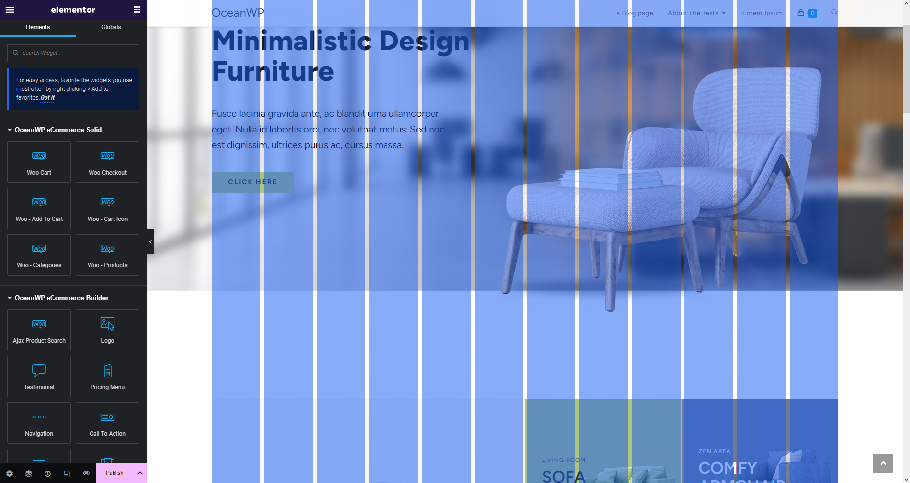
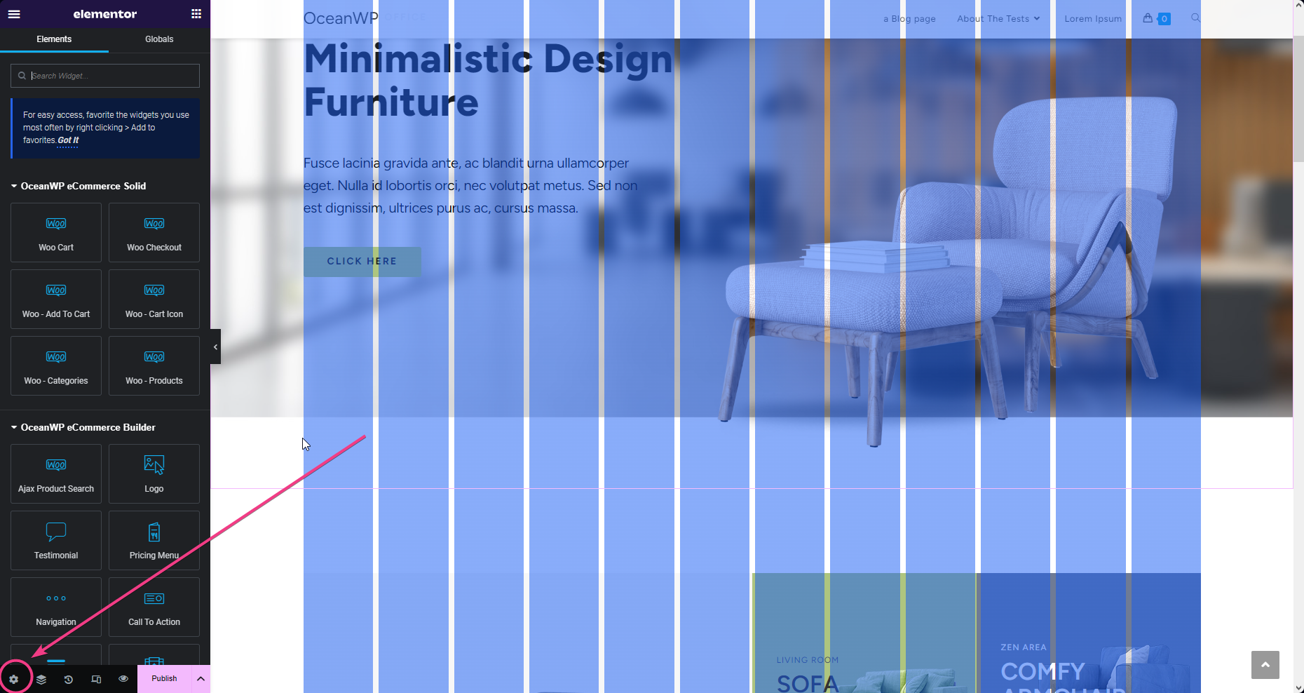
After that, load the page Settings by clicking the "cog" icon in the bottom corner.
Click the Columns Grid Frame section name to expand it and view all the settings, then toggle the button next to Columns Grid Frame to enable this feature and display columns.
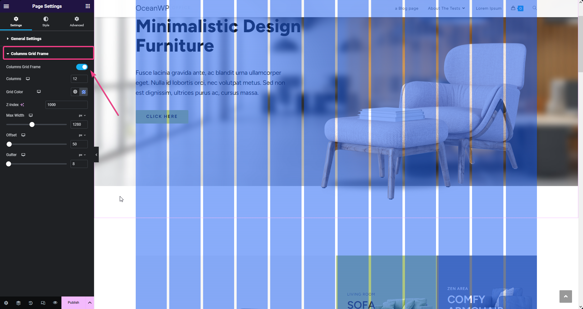
Columns Grid Frame Settings
Use the Columns Grid Frame settings based on your design preferences.
Available settings are:
- Columns: choose the number of vertical columns to display. Responsive options available.
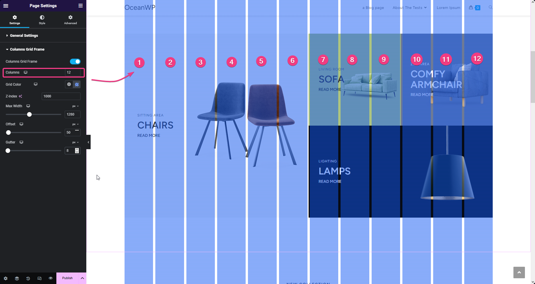
- Grid Color: choose the most appropriate grid color based on your design so that the columns always visible. Responsive options available.
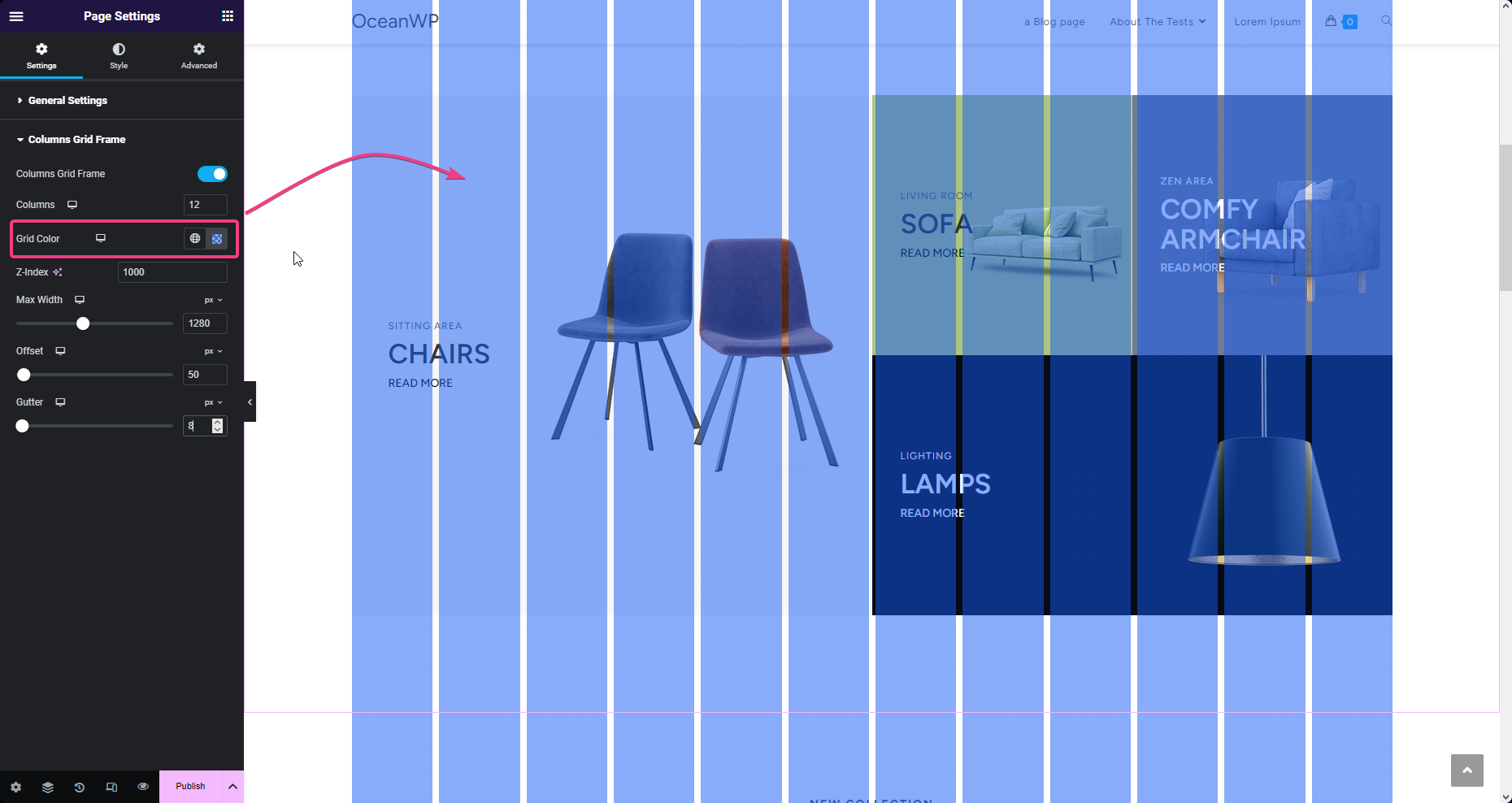
- Z-Index: enables the columns to be displayed atop of your design. Really no need to change any default settings, but you're free to play around.
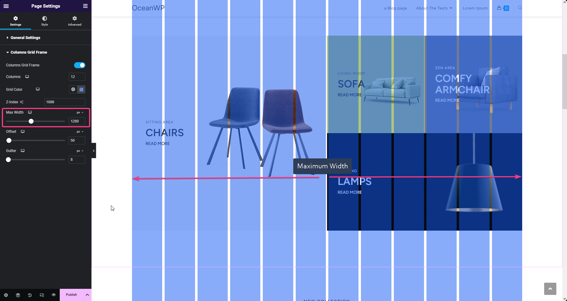
- Max-Width: choose the maximum width of the area on which the columns should be displayed. Responsive settings available.
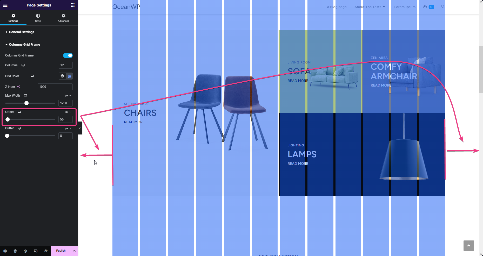
- Offset: set side (right and left) margins for the columns grid frame display. Responsive settings available.
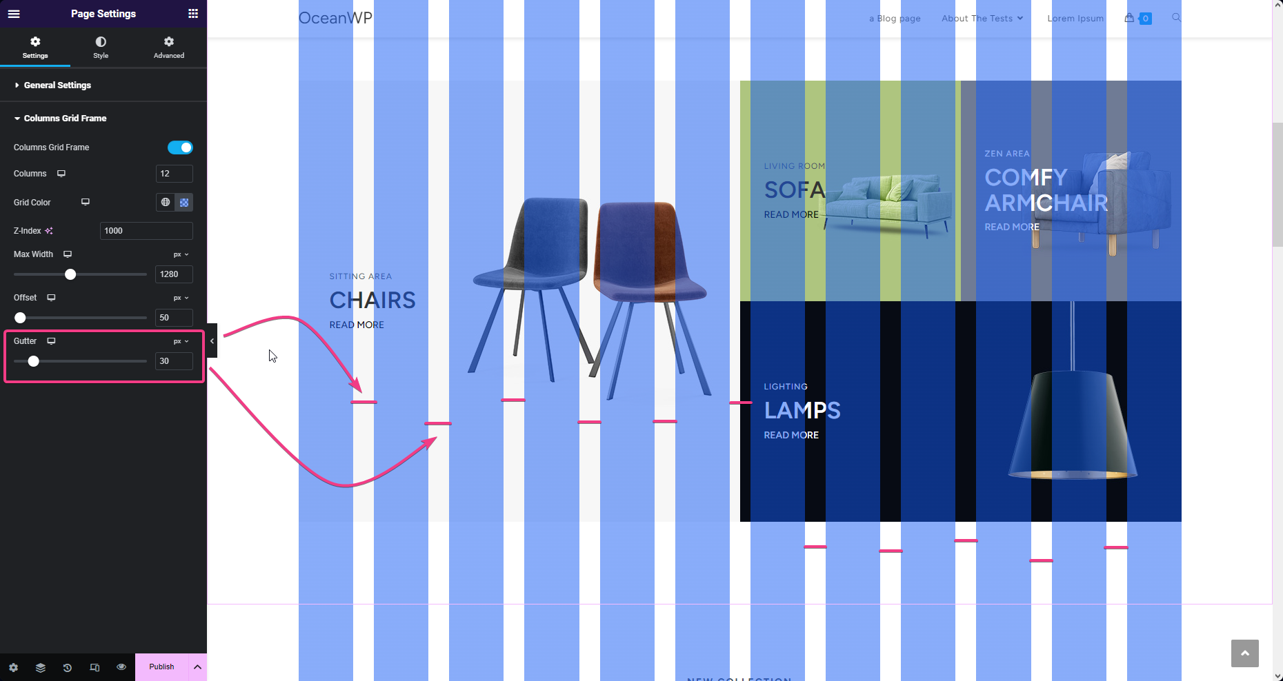
- Gutter: set the spacing between columns. Responsive settings available.
Columns Grid Frame Usage Tips & Tricks
Using the Columns Grid Frame is quite easy, but here are a few things you should know that could help you achieve better design:
- The Columns Grid Frame only serves as a visual design and will be displayed only inside the Elementor editor.
- You can enable or disable the Columns Grid Frame per need.
- The Columns Grid Frame settings are applied on the entire page, therefore you can adjust the settings like the columns number, gutter or color during editing of various sections and based on the design needs.
- You can use the responsive settings available to make a pixel-perfect design on tablet and mobile devices as well.
That's it!
Enjoy building your custom eCommerce website with OceanWP and Ocean eComm Treasure Box!
