How To Use the Popup Builder
Welcome to your Ocean eComm Treasure Box dashboard!
The Popup Builder feature of your Ocean eComm Treasure Box (Ocean eCommerce) premium plugin enables you to create different types of popups:
- Custom (using Elementor or Gutenberg), and
- Simple popups (using OceanWP prebuilt templates).
Enable the Popup Builder
As of Ocean eComm Treasure Box version 1.3.0, you have the ability to build an unlimited amount of popups.
To enable the Popup Builder feature:
- Go to your eCommerce OTB main Dashboard,
- navigate to the Modules menu,
- toggle the option next to the Popup Builder feature, and
- Save Changes.

After that, reload (refresh) your page.
Access the Popup Builder Settings
After enabling the Popup Builder feature and refreshing the page, under the eCommerce OTB navigation menu in the WordPress dashboard, you'll notice two additional options:
- Custom Popups, and
- Simple Popups.

Depending on the type of popup you want to build, choose the option you need.
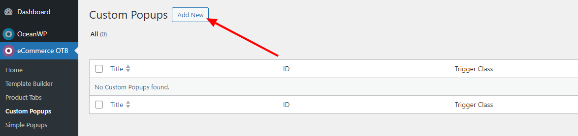
Create Custom Popups
The Custom Popups feature enables you to build popups using Gutenberg (default WordPress editor) or Elementor page builder.
Which type of popups content you actually prefer, we leave up to you 🙂
To create a custom popup, navigate to the Custom Popups option in your WordPress dashboard, and click the Add New button.
Once you've done that, you need to give your custom popup a name (Title). Without a name, WordPress will not save the file (not even as a draft), and the name is for internal use only (visible only to you).

Once your custom popup template has a name, you can choose whether to create a popup with Gutenberg or Elementor.
Build Custom Popups Using Gutenberg
After adding a title, you can now continue adding content using the default WordPress editor - Gutenberg.
What content you're going to add is entirely up to you.
Once you're satisfied with the content, you can now proceed with the Popup Settings, placed below the content area and which we're going to cover here in detail.

Custom Popup settings consist out of two tabs:
- General Settings, and
- Advanced Settings.
Custom Popup General Settings contain the following options:
- Show on Whole Site: when this feature is enabled, your popup will display on the entire website without exception. Likewise, when you select this option, the Select Pages (next option) will be hidden.
- Exclude Pages: this option is available when you want to display the popup on your entire website but exclude specific pages only (like, My Account, etc). Use CTRL + left mouse click (Win) or CMND + left mouse click (Mac) to select multiple pages. This feature is available as of Ocean eComm Treasure Box 1.4.0 version.
- Select Pages: Use this option if you want to display the popup on specific pages only. Use CTRL + left mouse click (Win) or CMND + left mouse click (Mac) to select multiple pages.
- Select Trigger: Use this option to choose what even will trigger the popup to display. Available options are:
- On Load: on page (website) load.
- On Click: use a custom CSS class to load the popup on button click.
- On Hover: use a custom CSS class to load the popup on the hover event.
- Popup Delay: Amount of seconds that needs to pass between the trigger event and popup display. For example, add the value 15 for the popup to display 15 seconds after the page has been loaded.
- Autoclose Delay: Amount of seconds the popup is displayed then closed automatically if the user doesn't close the popup themselves. For example, add the value of 30 if you want to display the popup for 30 seconds. Once 30 seconds expires, the popup will automatically close itself. To display the popup correctly, ensure this value is greater than 0.
- Popup Display Mode: Use this option to choose how many times the popup should display. Use this option in combination with your Trigger event.
- Every time: The popup will display absolutely every time based on the trigger event. Best suitable for the On Click and On Hover trigger events.
- One Time per Session: The popup will display only once per user session. Best suitable for the On Load trigger event.
- One Time: The popup will display only once.
- Popup Size: Use the percentage options to create a dynamic popup size, or use the option Custom to enter custom width and height for the popup.
- Enable Overlay: display a background when popup is displayed and choose a custom color for it.
- Select Position: Choose the position of the screen where the popup will display. For example, center of the screen, bottom left corner of the screen etc.
Custom Popup Advanced Settings contain the following options:
- Close Button: Choose whether the user should click the close button to close the popup or the ESC key on their keyboard.
- Disable on Mobile: choose whether or not to display popups on mobile devices.
Once you've gone through all settings, save your changes and that's it.
Of course, you can always revisit your settings and make adjustments per need.
Build Custom Popups Using Elementor
Building custom popups with Elementor functions in the same way as building custom popups with Gutenberg.
Your popup needs to have a title, and then you'll be adding content using Elementor (instead of Gutenberg). As you can see, it's quite simple.
The only difference is, Popup Settings are available below the content editor, as well as inside Elementor editor too. Both options are synced. This means that whatever changes you make using Popup Settings inside the Elementor editor will also be applied to the Popup Settings in the Metabox area.
To access Popup Settings inside the Elementor editor:
- click the cog icon at the bottom corner,
- expand the Popup Settings panel,
- apply your settings.

All settings function exactly like the above explained settings.
Apply your settings and save or publish your design. Readjust settings per need.
That's it! Your popup is ready to help you grow your business.

Create Simple Popups
The Simple Popups feature enables you to build popups using OceanWP prebuilt popup templates, no builders necessary.
The preview area enables you to preview your changes and customization live, making popup creation a piece of cake.
To create a simple popup, navigate to the Simple Popups option in your WordPress dashboard, and click the Add New button.

Next you'll see a screen where which contains:
- Popup title area,
- Popup preview area, and
- Popup Settings.

Of course, you'll Add a Title for your popup and then move on to the next step, which is to choose from one of our templates.
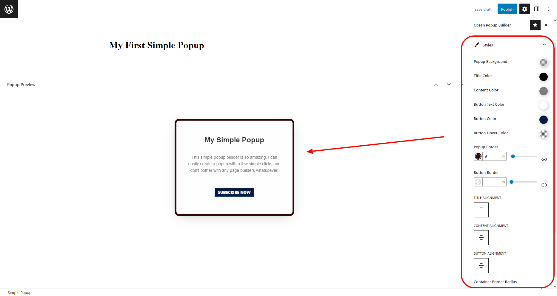
To access Ocean Popup Builder Settings, click the cog icon in the upper corner of the toolbar.

If you're using a distraction free mode and not seeing the cog icon, click the kebab menu (3 vertical dots), and select the Ocean Popup Builder option to preview the settings.

The Ocean Popup Builder consists out of 3 panels:
- General,
- Content, and
- Style.
The General panel is open by default and contains all the settings the Custom Popup builder does, plus the option to choose the Popup Style:
- Show on Whole Site: when this feature is enabled, your popup will display on the entire website without exception. Likewise, when you select this option, the Select Pages (next option) will be hidden.
- Select Pages: Use this option if you want to display the popup on specific pages only.
- Select a Popup Type: Choose between one of the 3 available styles.
- Popup Delay: Amount of seconds that needs to pass between the trigger event and popup display. For example, add the value 15 for the popup to display 15 seconds after the page has been loaded.
- Autoclose Delay: Amount of seconds the popup is displayed then closed automatically if the user doesn't close the popup themselves. For example, add the value of 30 if you want to display the popup for 30 seconds. Once 30 seconds expires, the popup will automatically close itself. To display the popup correctly, ensure this value is greater than 0.
- Select Trigger: Use this option to choose what even will trigger the popup to display. Available options are:
- On Load: on page (website) load.
- On Click: use a custom CSS class to load a popup on button click.
- On Hover: use a custom CSS class to load a popup on hover event.
- Popup Display Mode: Use this option to choose how many times the popup should display. Use this option in combination with your Trigger event.
- Every time: The popup will display absolutely every time based on the trigger event. Best suitable for the On Click and On Hover trigger events.
- One Time per Session: The popup will display only once per user session. Best suitable for the On Load trigger event.
- One Time: The popup will display only once.
- Select Position: Choose the position of the screen where the popup will display. For example, center of the screen, bottom left corner of the screen etc.
- Enable Overlay: display a background when popup is displayed and choose a custom color for it.
- Popup Size: Use the percentage options to create a dynamic popup size, or use the option Custom to enter custom width and height for the popup.
- Close Button: Choose whether the user should click the close button to close the popup or the ESC key on their keyboard.
- Disable on Mobile: choose whether or not to display popups on mobile devices.
Once you've gone through the General settings, it's time to add content through the Content panel.
Depending on the Popup Type you selected, you'll have the following options available:
- title,
- text,
- button text,
- image.

Now you have to style your popup, through the Styles panel.
The preview area will enable you to view all changes in real time and adjust everything in a breeze.
Once the styling is done, all you need to do is publish your popup and that's it!
How to Use Popups with Click and Hover Triggers
Whether you'll use a Custom or a Simple popup, you can display both types on Click and Hover events. This means that your popups can be displayed when users click buttons, icons, hover over specific sections or areas.
To add such popups, first you need to select the desired Trigger Event.
When your popup is published, navigate back to the main page (Custom Popups or Simple Popups), to preview all popups you created.

As displayed in the screenshot above, if a popup is set to trigger on Click or Hover, it will contain an automatically generated unique Trigger Class.
Likewise, if a popup is set to display only on specific pages as opposed to the entire website, the section Assigned Pages will contain the list of those pages.
To display your popup using the Click or Hover event, you need to copy the trigger class next to the popup. The Trigger Class format is: popup-trigger-XXX where the XXX represents the ID of the popup.
In the Trigger Class name, we also placed the dot (.) in front to clearly indicate it's a custom class. However, you'll be using this class without the dot.
Let's show you an example.
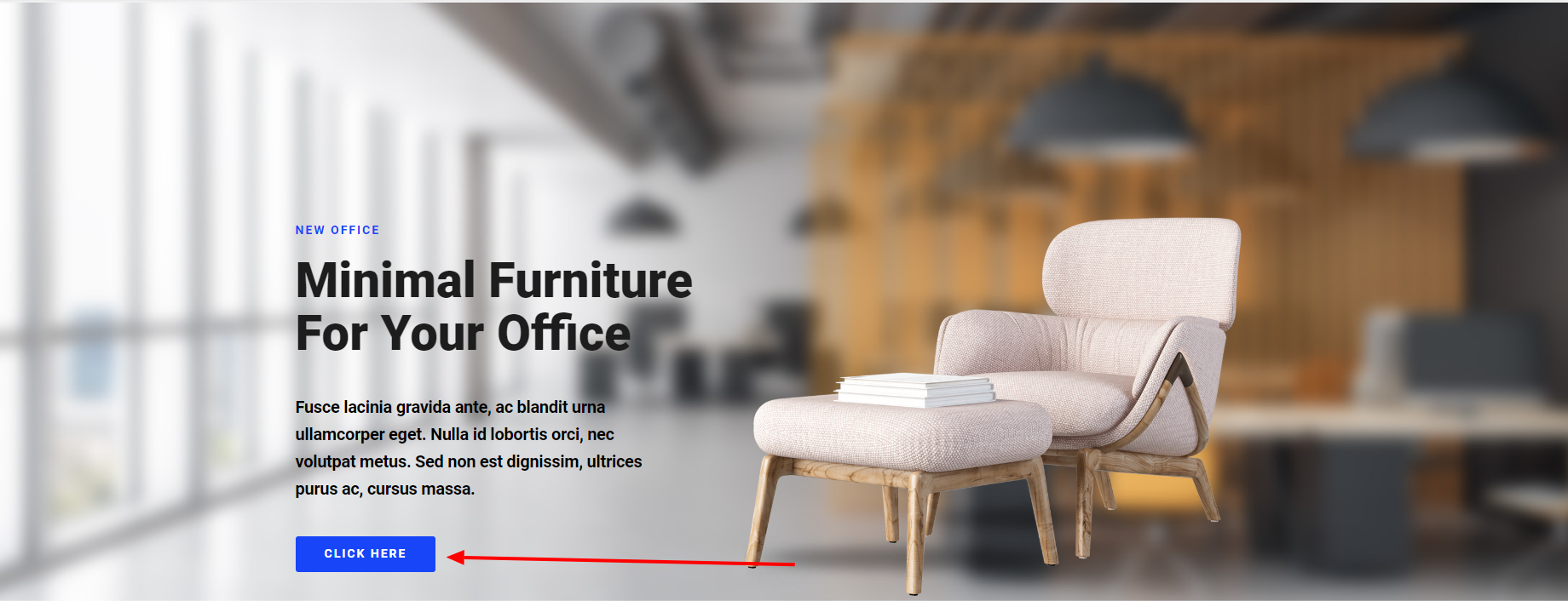
Let's say you have a button you want to display your popup when users click on it, like on the screenshot bellow:
Since our template was built using Elementor, will edit the template in Elementor page builder.
The next step is to select the Button widget we used in our design (you will select any widget or block of yours, depending on what you're trying to achieve).
Then we'll navigate to the Advanced tab of that widget.
In the CSS Classes area, you will paste the Trigger Class of the popup you wish to display and have previously copied. And remember, without the dot.

Now you need to save your changes and everything is setup and running.
That's it!
Happy website building!