Site Style & Settings - Customizer
Default theme settings may differ if you have imported one of the OceanWP prebuilt website templates for WordPress. This is because these templates come with their own Customizer settings. However, the way you use the Customizer to adjust your website remains the same.
The OceanWP Customizer Site Style & Settings panel enables you to choose the website layout, style buttons, pagination, and more.
Available Site Style & Settings options include:
Site Layout
The Site Layout panel enables you to style the main appearance of your website.
The Site Layout includes the following options:
- Site Layout panel,
- Content Settings section,
- Additional Content Settings panel,
- Site Background section,
- Site Background Options panel.
Site Layout panel
The Site Layout toggle panel contains options that enable you to choose the main website layout style.
You can choose between:
To select a website layout, simply click on the arrow button to expand the panel and select the suitable design for your website.
Once done, you can toggle the panel close again to keep your Customizer more organized.
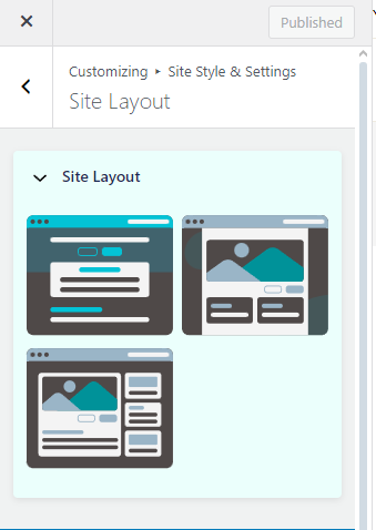
The rest of the settings in the main Site Layout panel depend on your Site Layout selection.
Wide Site Layout
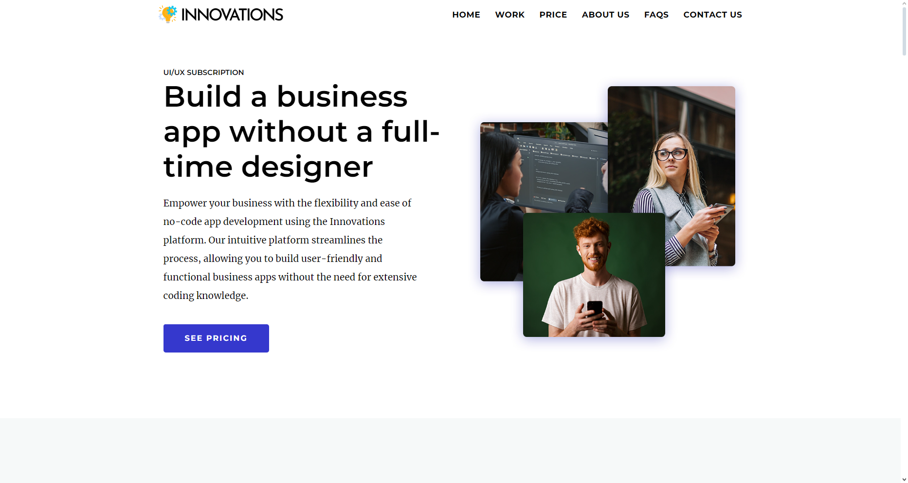
To apply the Wide site layout, toggle the Site Layout panel and select the Wide layout thumbnail.
The Wide site layout enables you to display your content from edge to edge. Check out the Innovations website template or Rockoslid website template for reference. Full website starter templates are available with the OceanWP Pro Bundle upgrade.
Boxed Site Layout
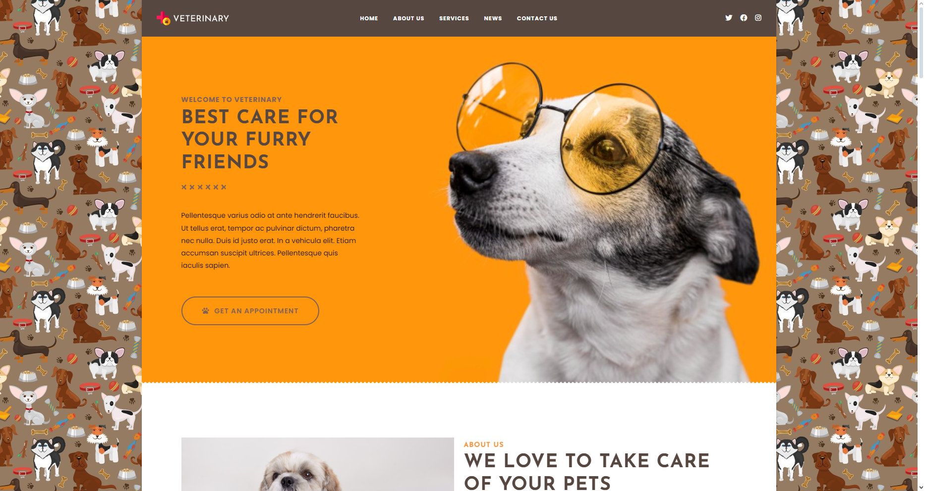
To apply the Boxed site layout, toggle the Site Layout panel, and select the Boxed layout thumbnail.
The Boxed site layout contains your entire site content (header, menu, posts, etc) inside a separate container, while you're able to apply different background options entirely.
Check out the Veterinary website template or Gardener website template for reference. Full website starter templates are available with the OceanWP Pro Bundle upgrade.
Separate Site Layout
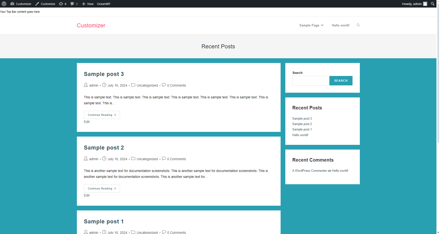
To apply the Separate site layout, toggle the Site Layout panel, and select the Separate layout thumbnail.
The Separate site layout, similarly to the Boxed site layout, separates your content and each widget in the sidebar by displaying them in individual containers respectively.
Content Settings section
The Content Settings sections contains additional website layout customization options, depending on your Site Layout:
- Wide, Boxed and Separate:
- Separate:
Main Container Width
The Main Container Width allows you to define the total width of your website content.
We recommend that you keep the unit in px (pixels) and choose a range between 1200 and 1400 px. There's no reason to go overboard.
Remember, you can always change individual page layout using the OceanWP Metabox Settings.
Content Width
The Content Width option is always measured with percentage (%).
This value will only be relevant if you're using a page (or post, or product, etc) sidebar page layout aka display a sidebar on all or any of your website pages.
In that case, the Content Width determines the how much of the main container width will be used by content itself.
If you're displaying pages without a sidebar, the content width will always be maximum.
Important to note, the Content Width and Sidebar Width values must always give 100% or less when summed up.
Sidebar Width
The Sidebar Width option is always measured with percentage (%).
This value will only be relevant if you're using a page (or post, or product, etc) sidebar page layout aka display a sidebar on all or any of your website pages.
In that case, the Sidebar Width determines the how much of the main container width will be used by the sidebar itself.
Important to note, the Content Width and Sidebar Width values must always give 100% or less when summed up.
Additional Content Settings panel
The Additional Content Settings panel contains options relevant only for the Separate site layout style.
Available Additional Content Settings options include:
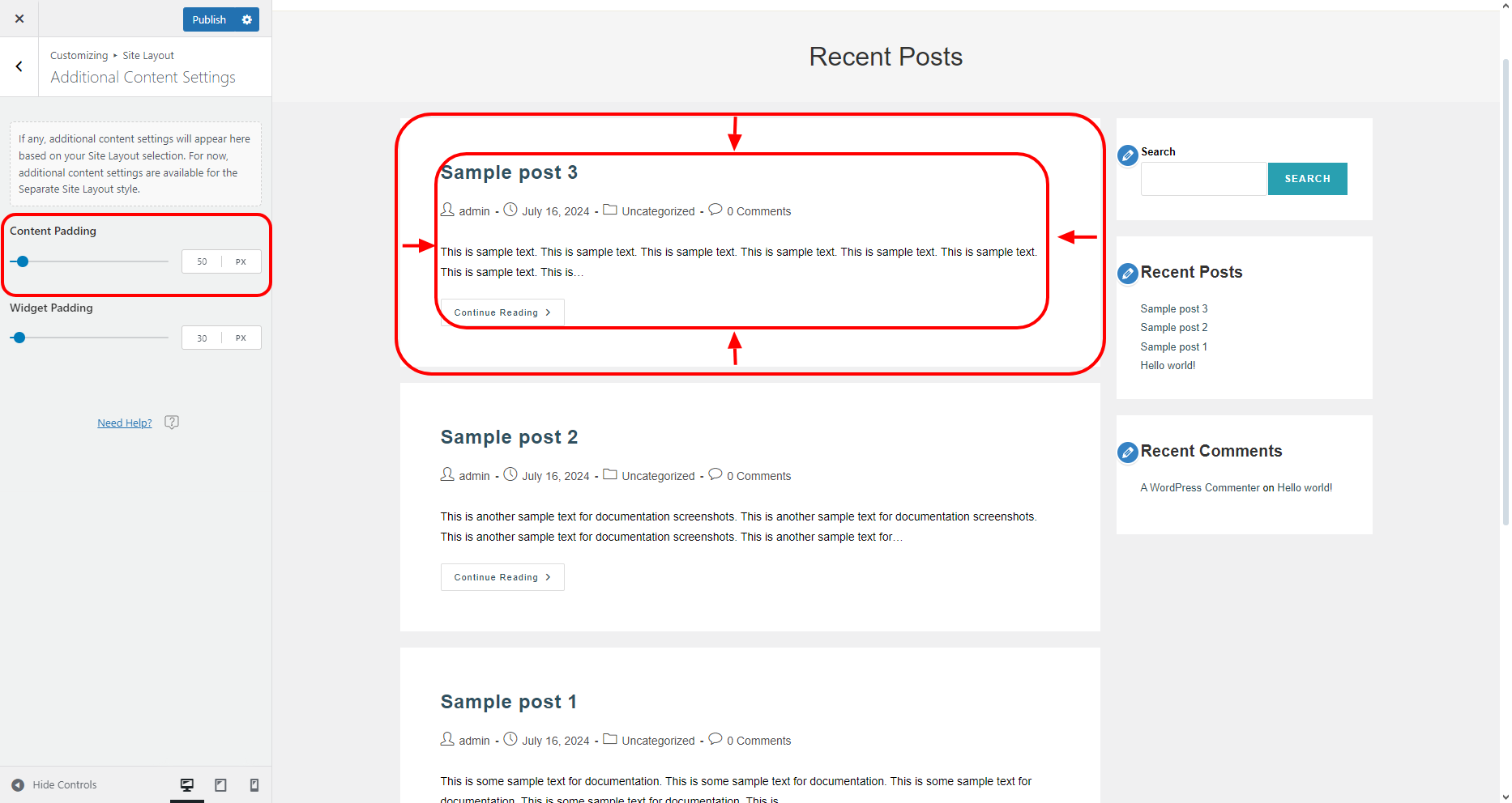
Content Padding
The Content Padding option enables you to control the padding (space) for content containers.
Padding is applied on all sides equally (top, bottom, right and left).
Widget Padding
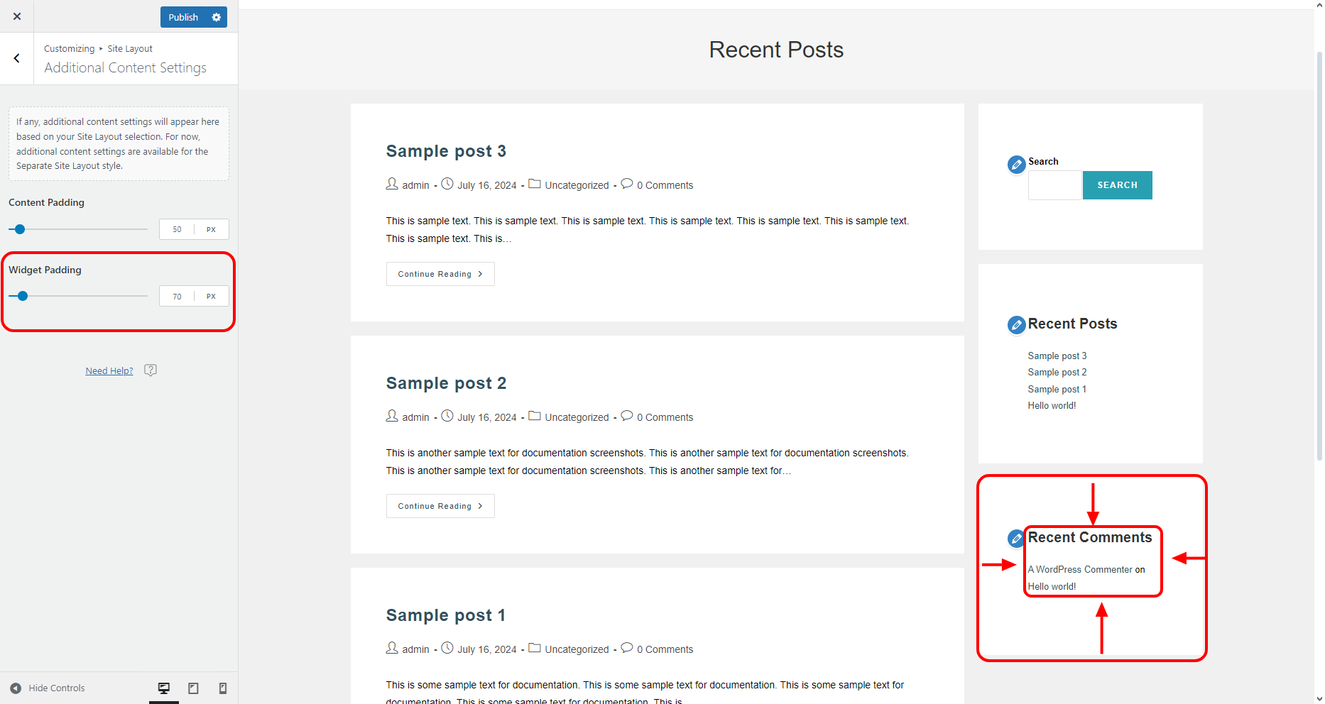
The Widget Padding option enables you to control the padding (space) for widget containers.
Padding is applied on all sides equally (top, bottom, right and left).
Site Background section
The Side Background section enables you to set either background color, image or both, depending on the selected Site Layout:
- Wide, Boxed and Separate:
- Image as website background.
- Wide and Separate:
- Boxed and Separate:
Background Color
To apply a color to your website background, simply click on the color option and adjust the tone you want.
You can use one of the colors from the quick color options, pick any color you want using the color picker tool, adjust opacity or simply add your own HEX, RGB or HSL code.
You may notice that you're able to access the website background color option from two options:
- Using the Site Layout option, and
- Using the main Colors panel.
Whatever option you choose to apply the website background color, the other option will automatically update itself.
Image
Instead of a solid background color, you can also use an image instead.
Using an image as a website background will override any previously applied background color settings.
To add an image as a website background, simply click the Add button.
Choose an image from your media library, then apply the most suitable image options for optimal results. Image options will appear only when an image is selected.
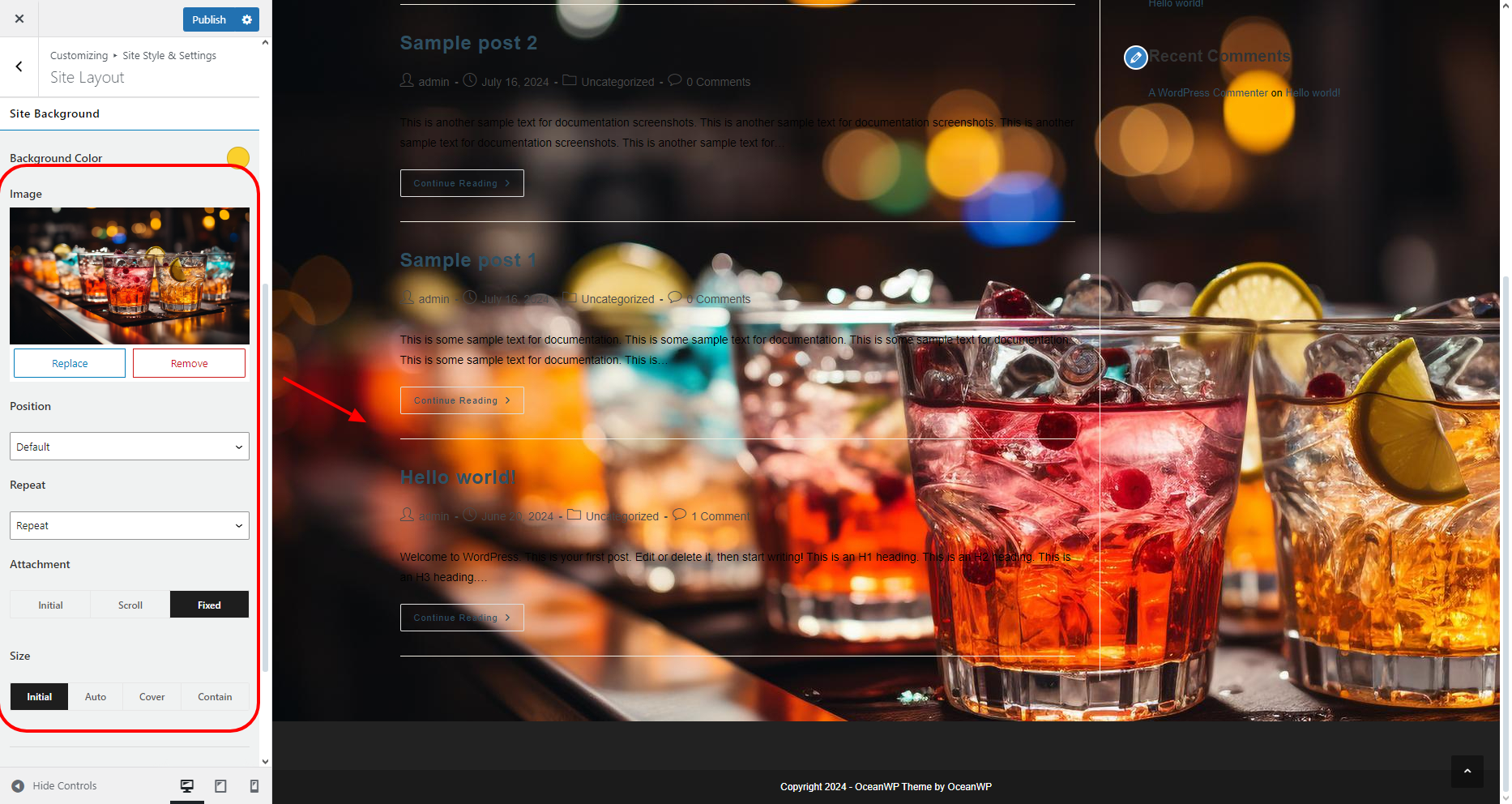
When it comes to the Boxed or Separate site layout, the selected background image will display behind the boxed content area. For more background options for the Boxed site layout, check the Site Background Options panel.
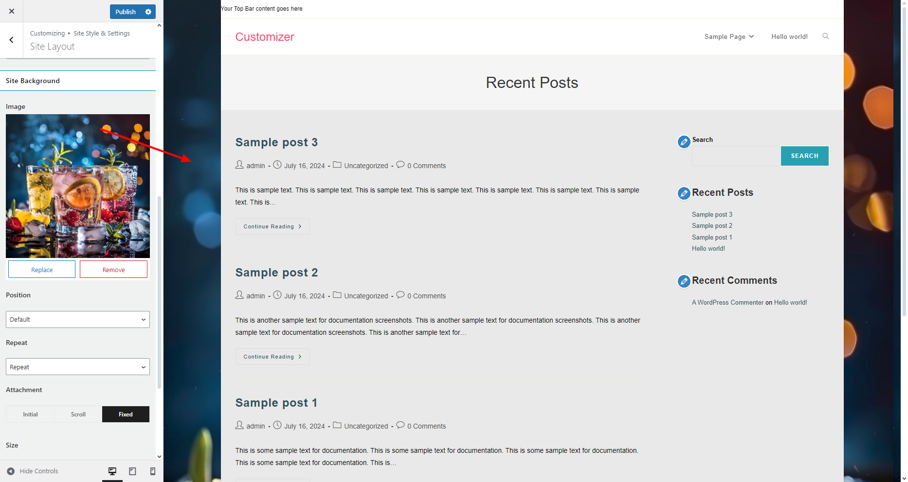
To replace the current website background image with a different one, simply click the Replace button, and choose a different file.
To remove the background image and use background color instead, simply click the Remove button.
Site Background Options panel
The Site Background Options panel contains additional background styling options relevant only to the Boxed and Separate site layout styles:
- Boxed:
- Separate:
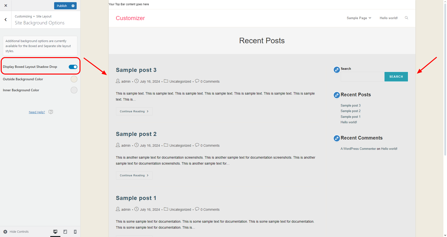
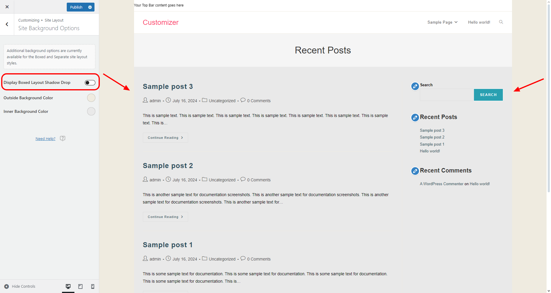
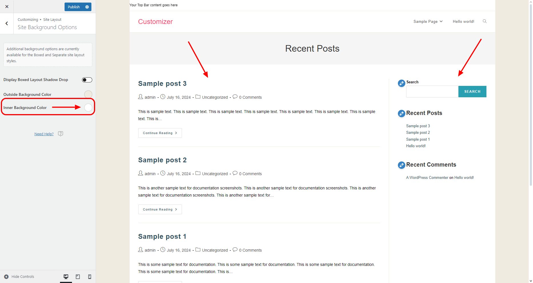
Display Boxed Layout Shadow Drop
The Display Boxed Layout Shadow Drop option will only function with the Boxed site layout.
When enabled, the feature will add a shadow drop effect outside your content area container, giving the content a stylish 3D effect.
Outside Background Color
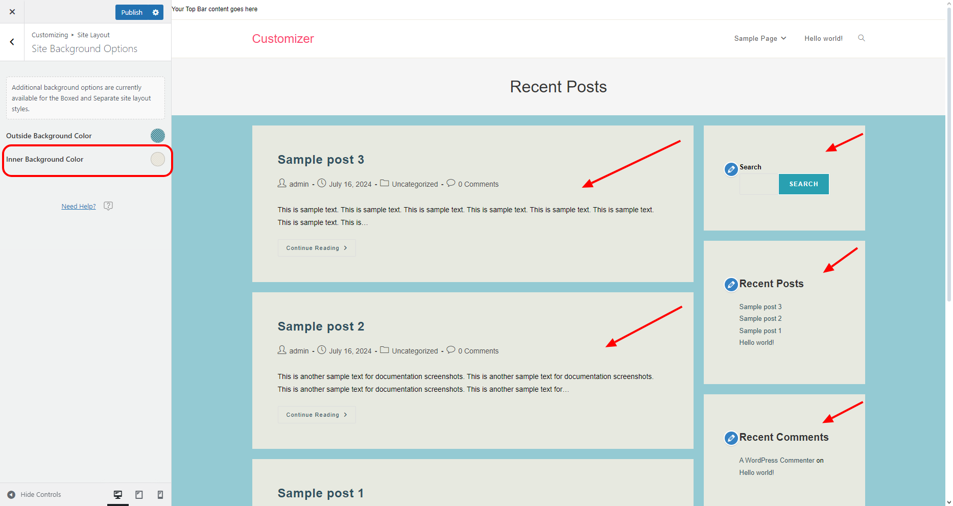
The Outside Background Color option enables you to apply a color background to your Boxed or Separate site layout.
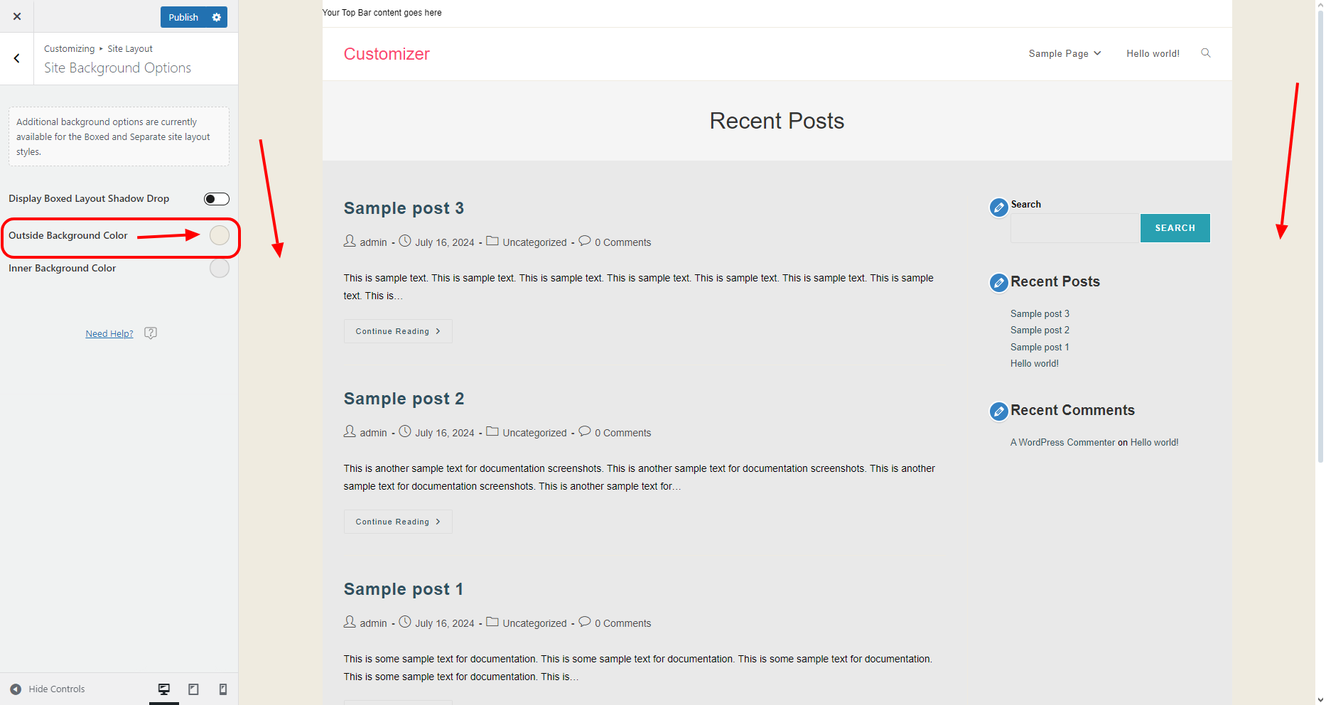
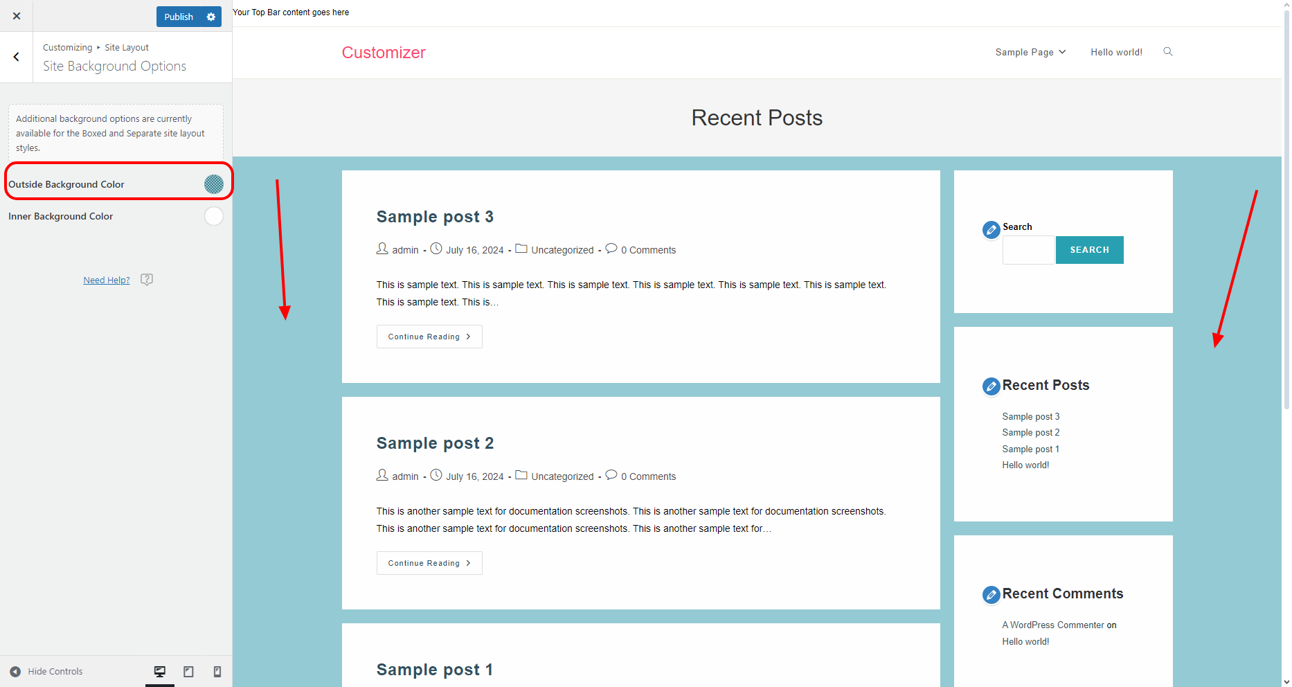
The Outside Background Color option will only function aka display color, if the Background Image option is not used (no image selected).
Likewise, the Outside Background Color will override the Background Color settings if previously applied from the Site Background section or the main Customizer Colors panel.
Inner Background Color
The Inner Background Color option enables you to apply a color to the main content container for the Boxed site layout, or each container for the Separate site layout.
Site Icons
The Site Icons option enables you to choose the preferred library for icons that appear in the theme automatically in some areas, i.e. not inserted by you manually. Such icons include social icons for Header and Top Bar, meta data icons, etc.
OceanWP includes 3 libraries:
- Simple Line Icons (default option),
- Font Awesome Icons,
- Ocean SVG Icons.
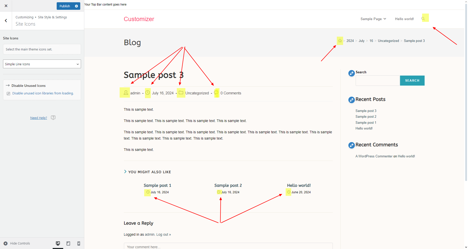

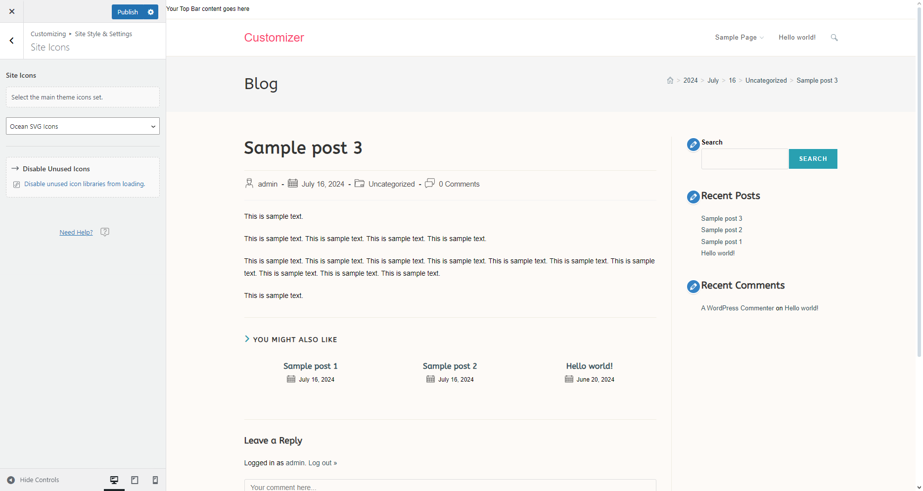
The Simple Line Icons is the smallest icon library. Icons that do not exist within this library are automatically replaced with Font Awesome Icons. For example, the social media icons in Header or Top Bar social menus.
Optimization and speed-wise, we recommend you choose between Font Awesome Icons or Ocean SVG Icons.
Once you decide upon a preferred icons library, you can disable unused icon libraries via Customize > Performance. This will only influence icons within OceanWP theme itself.
Site Buttons
The Site Buttons option enables you to style buttons on your website. For example, the Post Comment button on single blog posts.
The Site Buttons include the following settings:
Padding (px)
The Padding option enables you to add padding (spacing) to the button. This option is always measured in pixels (px).
You can apply different values for each of the four sides.
Radius (px)
The Radius option enables you to smooth out the button corners, by making them more or less sharp, so to speak. This option is always measured in pixels (px).
You can apply different values for each of the four corners.
Border Type
The Border Type option enables you to apply the styling to the border that goes around the button. You can choose between different styles, including None and Hidden if you don't want to display any border.
Border Width
The Border Width option enables you to determine the width of the border that goes around the button, if you choose to display a border.
Typography and Colors
The Typography and Colors section contains options that enable you to style the text and button appearance:
- Button Text (typography): apply font family, font size and more options to the button text.
- Background (color): apply button background color and color on hover.
- Text (color): apply button text regular and hover color.
- Border (color): apply button border regular and hover color.
Site Forms
The Site Forms option enables you to style submission forms on your website, such as the comment form on single blog posts.
The Site Forms panel includes the following settings:
Padding (px)
The Padding option enables you to add padding (spacing) to the form entry area. This option is always measured in pixels (px).
You can apply different values for each of the four sides.
Radius (px)
The Radius option enables you to smooth out the form container corners, by making them more or less sharp, so to speak. This option is always measured in pixels (px).
You can apply different values for each of the four corners.
Border Type
The Border Type option enables you to apply the styling to the border that goes around the around the form. You can choose between different styles, including None and Hidden if you don't want to display any border.
Border Width
The Border Width option enables you to determine the width of the border that goes around the form container, if you choose to display a border.
Typography and Colors
The Typography and Colors section contains options that enable you to style the form appearance:
- Label (typography): apply font family, font size and more options to the form label. Not all forms display labels.
- Placeholder (typography): apply font family, font size and more options to the placeholder text, ie. text displayed inside the form that usually describes the purpose of the form or form field.
- Text (typography): apply font family, font size and more options to the text that user inserts into the form or form field.
- Background (color): apply form or form field background color.
- Label (color): apply form label text color.
- Placeholder (color): apply form or form field placeholder text color.
- Text (color): apply color to the text that user inserts into the form or form field.
- Border (color): apply form or form field border regular color and hover color.
Scroll to Top
The Scroll to Top panel contains options to style and customize the Scroll to Top button.
The Scroll to Top button enables your website visitors to quickly get back to the beginning of the page.
The Scroll to Top contains the following settings:
- Enable Scroll to Top,
- Visibility,
- Button Size,
- Border Radius,
- Button Position panel,
- Button Icon panel,
- Background color option,
- Icon color option.
Enable Scroll to Top
Enable Scroll to Top toggle enables you to enable or disable the Scroll to Top button feature.
By default, this feature is enabled.
Visibility
The Visibility option enables you to choose on which devices you want to display your website:
- Show on All Devices: display on desktop, tablet, mobile.
- Hide on Tablet: display on desktop and mobile.
- Hide on Mobile: display on desktop and tablet.
- Hide on Tablet & Mobile: display on desktop only.
Button Size
The Button Size option enables you to choose the size of the entire button.
Border Radius
The Border Radius option enables you to choose the smoothness (roundness) of the button corners. This value is always measured in pixels (px).
You can apply different values for each of the four corners.
Button Position panel
The Button Position panel contains options that enable you to adjust the position of the button compared to the side of the screen and the bottom of the screen:
Position
The Position option enables you to choose on which side of the screen the Scroll to Top button will be displayed: Left or Right.
Bottom Position
The Bottom Position option enables you to determine the spacing between the button and the bottom of the screen.
Side Position
The Side Position option enables you to determine the spacing between the button and the side of the screen.
Button Icon panel
The Button Icon panel contains options that enable you to adjust the icon of the Scroll to Top button:
Icon Size
The Icon Size option enables you to determine the size of the icon inside the Scroll to Top button.
Select Icon
The Select Icon option enables you to choose which icon you wish to display inside the Scroll to Top button.
Background color option
The Background color option enables you to assign a color to the the Scroll to Top button, both on regular state and hover.
Icon Color option
The Icon Color option enables you to assign a color to the Scroll to Top button, both on regular state and hover.
Site Pagination
The Site Pagination panel enables you to style the default pagination option on your website ( 1, 2, 3, ... ). OceanWP offers you multiple pagination style (blog, product archives, etc), therefore those additional pagination options can be styled directly and respectively.
The Site Pagination panel offers the following options:
Position
The Position option enables you to determine the position of the pagination buttons: Left, Center, and Right.
Border Width
The Border Width option enables you to determine the width of the border surrounding each pagination button.
Border Radius
The Border Radius option is always applied in pixels (px). This option enables you to apply border radius to all pagination buttons for a rounded corners effect.
Typography and Colors section.
The Site Panel Typography and Colors section includes the following settings:
- Pagination Text Size: determines the size of numbers and navigation arrows inside pagination buttons.
- Background (color): apply pagination button background color in regular and hover state. The hover background color is also the active button background color.
- Pagination Text (color): apply pagination button text (numbers and arrows) regular and hover color. The hover color is also the active button color.
- Border (color): apply pagination button border color in regular and hover state. The hover color is also the active button border color.
Found an error in this doc or believe it needs improvement?
Send us a prepurchase ticket, include the URL of the page, and add suggestions and more details about how we can make things better for you.
That's it!
Happy website building with OceanWP!


