Portfolio - Customizer
Default theme settings may differ if you have imported one of the OceanWP prebuilt website templates for WordPress. This is because these templates come with their own Customizer settings. However, the way you use the Customizer to adjust your website remains the same.
The OceanWP Customizer Portfolio panel enables you to any type of portfolio you want (your artwork, websites, photography, etc), display filters, create shortcodes to display specific items only, and mre.
Portfolio is a premium OceanWP plugin and available with the OceanWP Pro Bundle.
The Portfolio panel in the Customizer will appear when you install and activate this premium OceanWP extension.
Available Portfolio options include:
General
The General panel enables you to choose the main portfolio page which is going to be used in individual portfolio items breadcrumbs, as well as apply other portfolio items slug (URL) settings.
Available General settings include:
Portfolio Page
The Portfolio Page option enables you to choose the main portfolio page, which is going to be used in breadcrumbs for individual portfolio items, and of course, linked to it.


The main portfolio page functions the exact same way the main blog or shop page would act, by displaying all your individual portfolio items.
Setting up a main portfolio page is simple:
- Navigate to WP Dashboard, Pages > All Pages,
- Create a new page,
- Add a desired title and slug,
- For page template choose: Portfolio
- Publish page.
The main portfolio page is populated automatically (similar to the blog page). You cannot edit the main portfolio page using page builders.

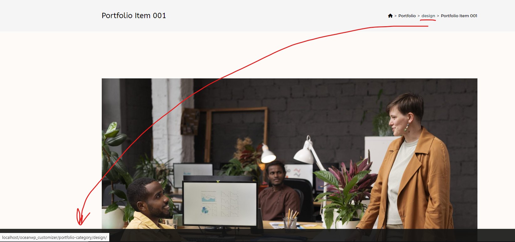
Portfolio Item Slug
The Portfolio Item Slug option enables you to add a custom slug which is going to be used for individual portfolio items inside URLs.
Example: https://youwebsiteurl.com/portfolio /single-portfolio-name
Default slug value is: portfolio

If you choose to change default settings and use a custom slug instead, remember to refresh permalinks after apply these settings.
To refresh permalinks, navigate to WP Dashboard, Settings > Permalinks and hit the Save Changes button a couple of times.
Clear cache on all levels (website, CDN, browser).
Portfolio Category Slug
The Portfolio Category Slug option enables you to add a custom slug that would describe all categories, and which is going to be used inside URLs.
Example: https://youwebsiteurl.com/portfolio-category /portfolio-category-name
Default slug value is: portfolio-category
If you choose to change default settings and use a custom slug instead, remember to refresh permalinks after apply these settings.
To refresh permalinks, navigate to WP Dashboard, Settings > Permalinks and hit the Save Changes button a couple of times.
Clear cache on all levels (website, CDN, browser).
Portfolio Tag Slug
The Portfolio Tag Slug option enables you to add a custom slug that would describe all tags, and which is going to be used inside URLs.
Example: https://youwebsiteurl.com/portfolio-tag /portfolio-tag-name
Default slug value is: portfolio-tag
The Portfolio Tag Slug option functions the exact same way the Portfolio Category Slug option does.
If you choose to change default settings and use a custom slug instead, remember to refresh permalinks after apply these settings.
To refresh permalinks, navigate to WP Dashboard, Settings > Permalinks and hit the Save Changes button a couple of times.
Clear cache on all levels (website, CDN, browser).
Archive
The Archive panel enables you to customize and style the main portfolio page, as well as all portfolio archive pages (categories and tags).
Available options include:
- Layout,
- Posts per Page,
- Columns,
- Masonry,
- Title / Category Position,
- Display Title,
- Add Title Link,
- Title HTML Tag,
- Display Category,
- Display Pagination,
- Pagination Position.
Layout
The Layout options enables you to set the main page layout for the main portfolio and all portfolio archive pages (categories and tags).

Choose the layout you want to use the most on all portfolio archive items. You can always apply individual page layout for the main portfolio page using OceanWP Metabox Settings.
Posts per Page
The Posts per Page option enables you to choose how many items you want to display on the main portfolio and portfolio archive pages per page.

If you want to display all items (no pagination), insert: -1
Columns
The Columns option enables you to choose the number of columns to display portfolio items.

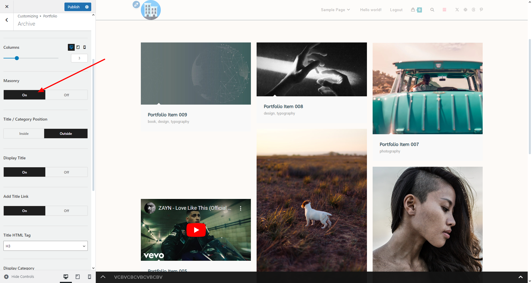
Masonry
The Masonry option enables you to display your items in a masonry layout, if this option is enabled (set to On).

By default, all items will be aligned at the top of each row, while each row will resume the height of the highest element displayed in that row.
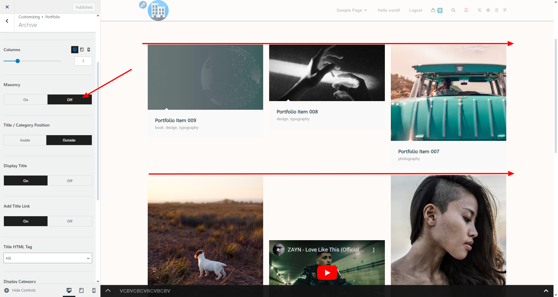
The Masonry layout is especially useful if you're using featured images of different sizes and orientation for your portfolio items.
Title / Category Position
The Title / Category Position option enables you to choose where you want to display individual portfolio items names and category information:
- Inside: displays information only when hovered over the portfolio item image.
- Outside: always visible in a dedicated box right under the portfolio item image.


Display Title
The Display Title option enables you to choose whether or not you want to display the portfolio item name.

Add Title Link
The Add Title Link option functions in conjunction with the Display Title option.
If you're displaying the title, the Add Title Link option enables you to choose whether or not you want the Title to be clickable (link to the portfolio item itself) or display as plain text (not clickable).
Title HTML Tag
The Title HTML Tag option functions in conjunction with the Display Title option.
If you're displaying the title, the Title HTML Tag option enables you to apply the correct HTML tag based on your SEO goals and other settings.

For example, if you're displaying the main Page Title, we recommend setting the Title HTML Tag option to H2.
Display Category
The Display Category option enables you to choose whether or not you want to display the category (categories) an individual portfolio item belongs to.
When the Display Category option is enabled, category names (and links) are displayed beneath the portfolio item title.

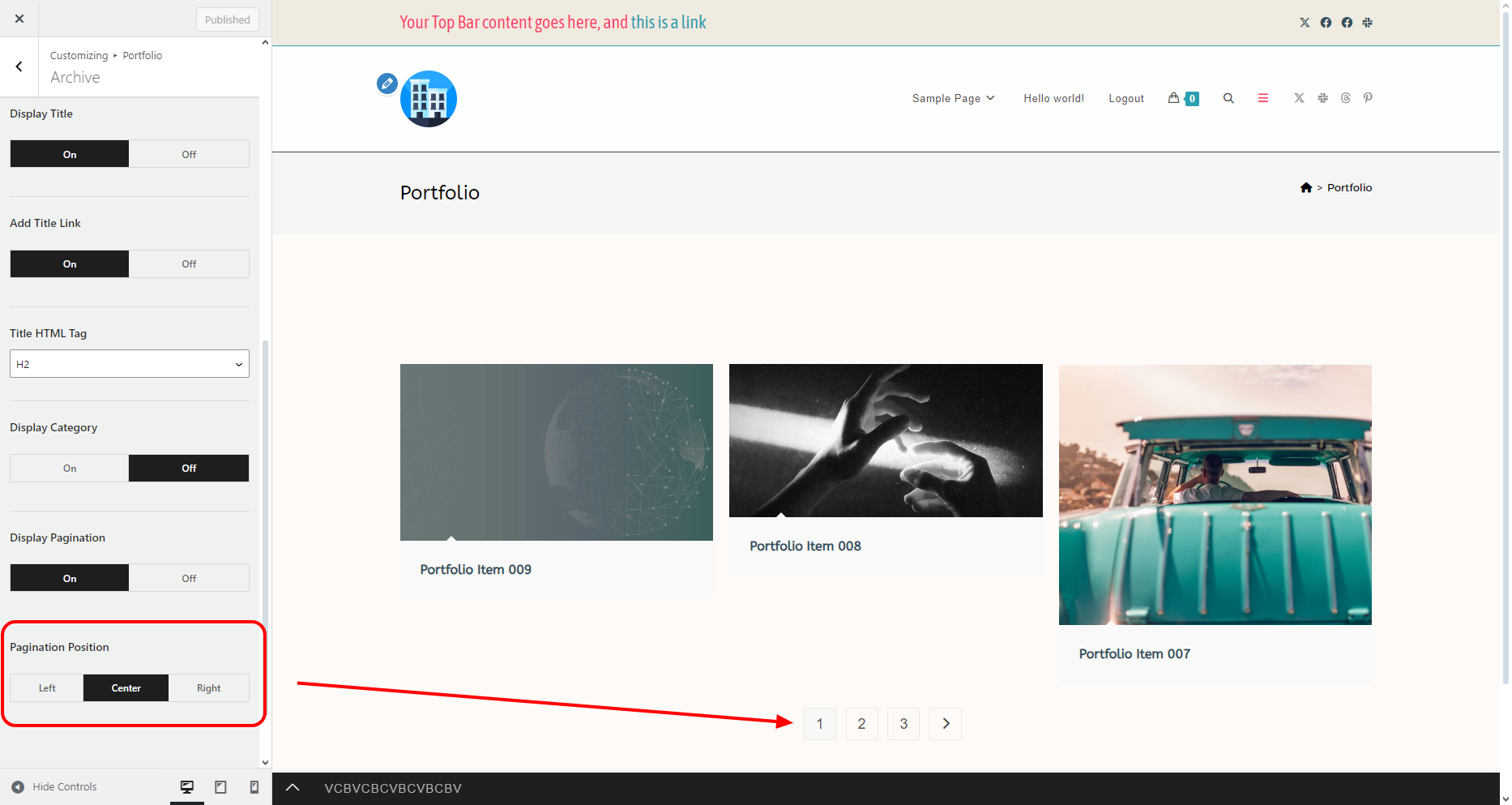
Display Pagination
The Display Pagination option enables you to choose whether or not you want to display pagination, which is recommended if you're not displaying all items at once, ie. display a specific number of items per page.

Pagination Position
The Pagination Position option functions in conjunction with the Display Pagination option and enables you to choose where the pagination option should be positioned: Left, Center, or Right.
Filter Bar
The Filter Bar panel contains all the options that enable you to choose whether or not you want to display a filter on the main portfolio page, choose a filter type, as well as apply various settings.
Available options include:
- Display Filter,
- Filter Type,
- Default:
- Filter Button:
- Filter Position,
- Filter Button section:
- Filter Reset Button section:
- Filter Apply Button section:
- Filter Inside Reset Button section:
Display Filter
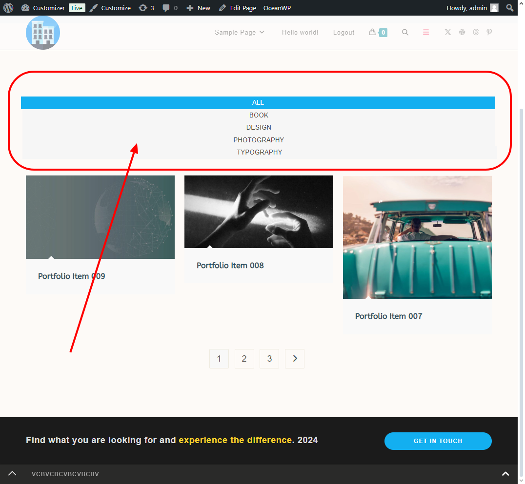
The Display Filter option enables you to choose whether or not you want to display a filter option on the main portfolio page, allowing users to browse through displayed items.
Filter Type
The Filter Type option enables you to choose which type of a filter you want to display on the main portfolio page:
- Default: an AJAX filter, performs a search ONLY through items displayed on the current page without the page being reloaded.

- Filter Button: a filter button which opens a search form modal window to enable users to search between categories, tags or a specific query input. This search option performs the search among all available portfolio items.


Display Link All
The Display Link All (Default filter type) option enables you to choose whether or not you want to display the button with the title ALL, which enables users to display all portfolio items on the page that were supposed to be displayed by default or that were displayed before using other filter options.

Filter Position
The Filter Position (Default filter type) option enables you to choose the position of the filter display horizontally:
- Full: stretched,
- Left: displayed on the left,
- Center: displayed in the middle,
- Right: displayed on the right side.

Taxonomy
The Taxonomy (Default filter type) option enables you to choose the taxonomy to display in the filter, ie enable your users to browse among displayed items based on the:
- Categories: displays all available portfolio categories.
- Tags: displays all available portfolio tags.


Categories and / or tags correspond to categories and / or tags you assigned to all of your individual portfolio items.

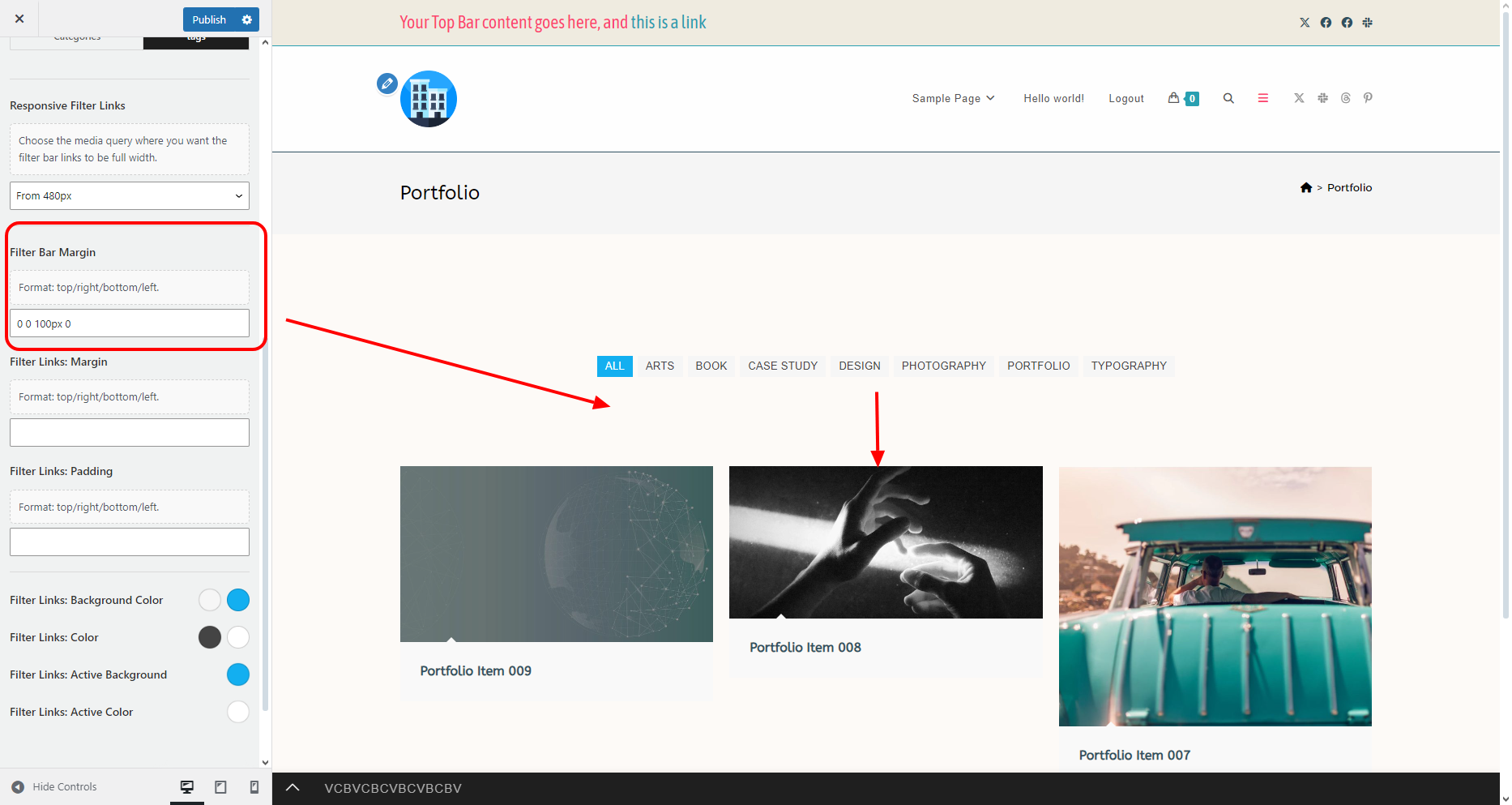
Responsive Filter Links
The Responsive Filter Links (Default filter type) option enables you to choose the device from which the filter links will start displaying in full width.
The chosen value affects devices starting from the selected with and lower.
Example, if you choose 1080px width, filter buttons will display in full width from 1080px device screen width and all devices width screen width smaller than 1080px.

Filter Bar Margin
The Filter Bar Margin (Default filter type) option enables you to apply margins around the entire filter.
Add values following CSS rules (top, right, bottom, left). Separate values using space.
Examples:
- 10px: will apply a 10px margin all around - top, right, bottom, left.
- 10px 50px: will apply a 10px margin on top and bottom, 50px margin on the sides (left and right).
- 10px 50px 30px: will apply a 10px margin on the top, 50px margin on the sides (left and right), 30px margin on the bottom.
- 10px 50px 30px 20px: will apply a 10px margin on the top, 50px margin on the right, 30px margin on the bottom, and a 20px margin on the left.

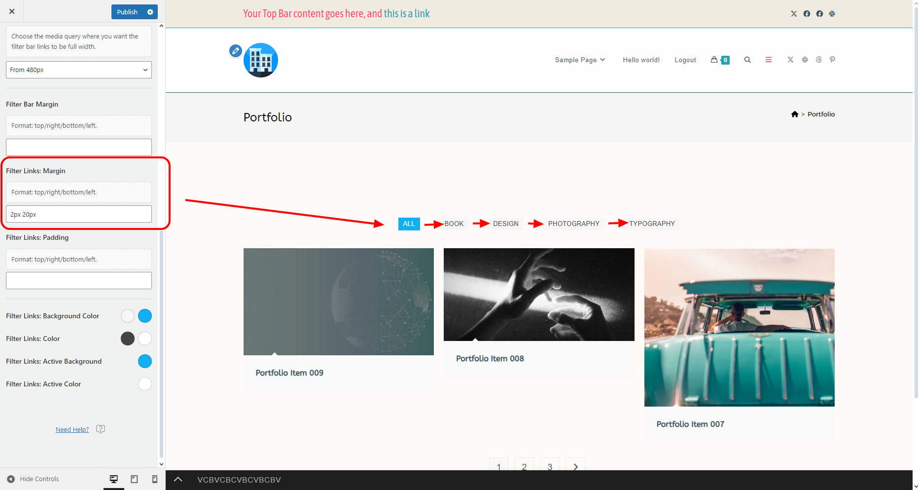
Filter Links: Margin
The Filter Links: Margin (Default filter type) option enables you to apply margins around each of the buttons displayed in the filter, enabling you to increase / decrease the gap between buttons, etc.
Add values following CSS rules (top, right, bottom, left). Separate values using space.
Examples:
- 10px: will apply a 10px margin all around - top, right, bottom, left.
- 10px 50px: will apply a 10px margin on top and bottom, 50px margin on the sides (left and right).
- 10px 50px 30px: will apply a 10px margin on the top, 50px margin on the sides (left and right), 30px margin on the bottom.
- 10px 50px 30px 20px: will apply a 10px margin on the top, 50px margin on the right, 30px margin on the bottom, and a 20px margin on the left.
Filter Links: Padding
The Filter Links: Padding (Default filter type) option enables you to apply padding (spacing) inside each of the buttons displayed in the filter, enabling you to increase / decrease the size of the buttons.
Add values following CSS rules (top, right, bottom, left). Separate values using space.
Examples:
- 10px: will apply 10px padding all around - top, right, bottom, left.
- 10px 50px: will apply 10px padding on top and bottom, 50px padding on the sides (left and right).
- 10px 50px 30px: will apply 10px padding on the top, 50px padding on the sides (left and right), 30px padding on the bottom.
- 10px 50px 30px 20px: will apply 10px padding on the top, 50px padding on the right, 30px padding on the bottom, and 20px padding on the left.

Filter Links: Background Color
The Filter Links: Background Color (Default filter type) option enables you to apply regular and hover color to the filter buttons background.

Filter Links: Color
The Filter Links: Color (Default filter type) option enables you to apply regular and hover color to filter item links (names).

Filter Links: Active Background
The Filter Links: Active Background (Default filter type) option enables you to apply a background color to the currently active filter item.

Filter Links: Active Color
The Filter Links: Active Color (Default filter type) option enables you to apply a color to the link (name) of the currently active filter item.

Filter Position
The Filter Position (Filter Button filter type) option enables you to choose the horizontal position of the filter button:
- Full: stretched,
- Left: displayed on the left,
- Center: displayed in the middle,
- Right: displayed on the right side.

Filter Button Icon Class
The Filter Button Icon Class (Filter Button filter type) option enables you to add your own custom icon class if you want do display a different icon other than the default hamburger icon.

Padding
The Padding (Filter Button filter type) option enables you to apply padding (add spacing) to the main filter button.

Border Width
The Border Width (Filter Button filter type) option enables you to add border around the main filter button.
The border is applied all around: top, right, bottom, and left.

Border Radius
The Border Radius (Filter Button filter type) option enables you to apply border radius to the main filter button, allowing you to create rounded corners.
The Border Radius is applied on all corners equally.

Text Color
The Text Color (Filter Button filter type) option enables you to apply regular and hover color for the word FILTER in the main filter button.

Background Color
The Background Color (Filter Button filter type) option enables you to apply regular and hover color to the main filter button background.
Icon Color
The Icon Color (Filter Button filter type) option enables you to apply regular and hover color to the main filter button icon.
If no specific icon color has been selected, the Text Color will be applied to the icon as well.
Border Color
The Border Color (Filter Button filter type) option enables you to apply regular and hover color to the border surrounding the main filter button.
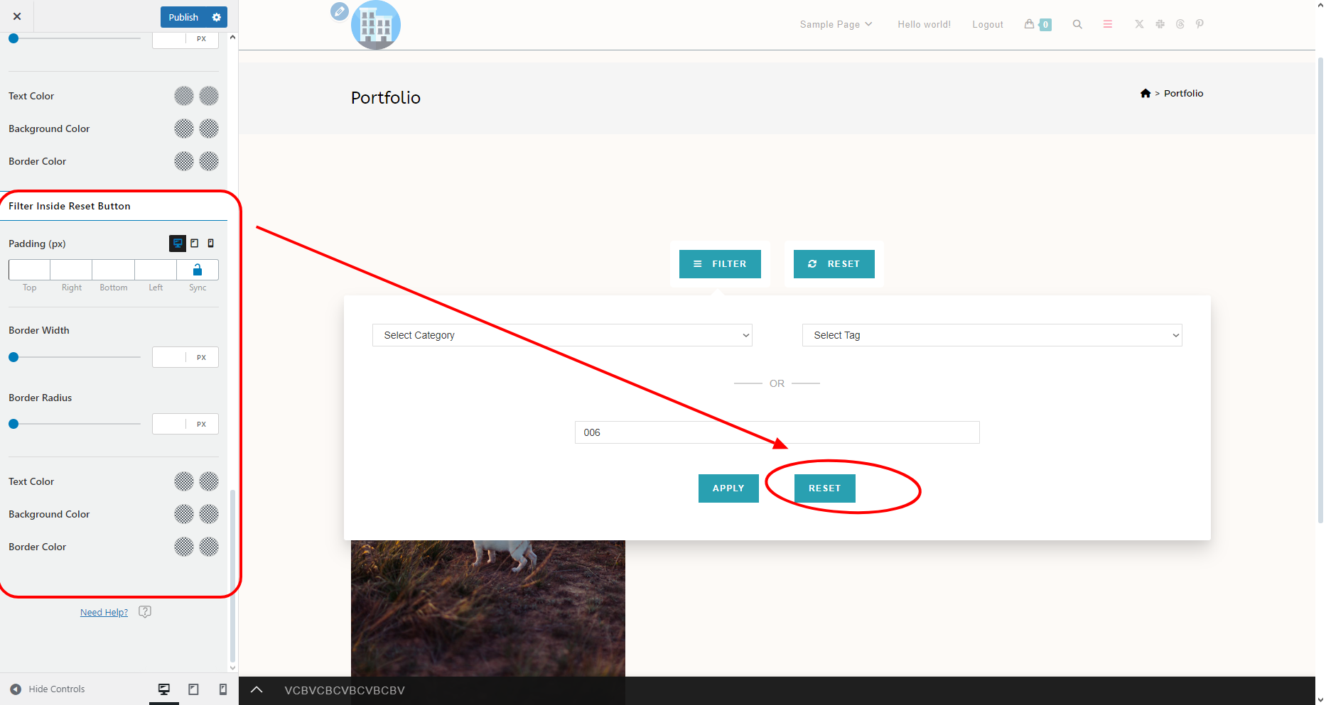
Reset Button Icon Class
The Reset Button Icon Class (Filter Button filter type) enables you to add your own custom icon class if you want do display a different icon other than the default sync icon.
This option is for the external reset button, which appears once a search query has been applied and is then placed next to the main filter button, enabling users to reset the current search options and start from the beginning.
To replicate:
- Click the Filter button,
- Enter a search query,
- Hit the Apply button.

Padding
The Padding (Filter Button filter type) option enables you to apply padding (add spacing) to the external reset filter button.
Border Width
The Border Width (Filter Button filter type) option enables you to add border around the external reset filter button.
The border is applied all around: top, right, bottom, and left.
Border Radius
The Border Radius (Filter Button filter type) option enables you to apply border radius to the external reset filter button, allowing you to create rounded corners.
The Border Radius is applied on all corners equally.
Text Color
The Text Color (Filter Button filter type) option enables you to apply regular and hover color for the word RESET in the external reset filter button.
Background Color
The Background Color (Filter Button filter type) option enables you to apply regular and hover color to the external reset filter button background.
Icon Color
The Icon Color (Filter Button filter type) option enables you to apply regular and hover color to the external reset button icon.
If no specific icon color has been selected, the Text Color will be applied to the icon as well.
Border Color
The Border Color (Filter Button filter type) option enables you to apply regular and hover color to the border surrounding the external reset filter button.
Padding
The Padding (Filter Button filter type) option enables you to apply padding (add spacing) to the filter search form apply button.

Border Width
The Border Width (Filter Button filter type) option enables you to add border around the filter apply button.
The border is applied all around: top, right, bottom, and left.
Border Radius
The Border Radius (Filter Button filter type) option enables you to apply border radius to the filter apply button, allowing you to create rounded corners.
The Border Radius is applied on all corners equally.
Text Color
The Text Color (Filter Button filter type) option enables you to apply regular and hover color for the word APPLY in the filter apply button.
Background Color
The Background Color (Filter Button filter type) option enables you to apply regular and hover color to the filter apply button background.
Border Color
The Border Color (Filter Button filter type) option enables you to apply regular and hover color to the border surrounding the filter apply button.
Padding
The Padding (Filter Button filter type) option enables you to apply padding (add spacing) to the filter search form reset button.
Border Width
The Border Width (Filter Button filter type) option enables you to add border around the search form reset button.
The border is applied all around: top, right, bottom, and left.
Border Radius
The Border Radius (Filter Button filter type) option enables you to apply border radius to the filter search form reset button, allowing you to create rounded corners.
The Border Radius is applied on all corners equally.
Text Color
The Text Color (Filter Button filter type) option enables you to apply regular and hover color for the word RESET in the search form reset button.
Background Color
The Background Color (Filter Button filter type) option enables you to apply regular and hover color to the search form reset button background.
Border Color
The Border Color (Filter Button filter type) option enables you to apply regular and hover color to the border surrounding the search form reset button.
Image
The Image panel contains various options related to portfolio image functionality, display and other features.
Available options include:
- Image Target,
- Image Size,
- Overlay Color,
- Display Overlay Icons,
- Display Link Icon,
- Display Lightbox Icon,
- Overlay Icons Width (px),
- Overlay Icons Height (px),
- Overlay Icons Size (px),
- Overlay Icons Background,
- Overlay Icons Color,
- Overlay Icons Border Radius,
- Overlay Icons Border Width,
- Overlay Icons Border Style,
- Overlay Icons Border,
- Image Animation section:
Image Target
The Image Target option enables you to choose what should happen when the user clicks on the image:
- Open Portfolio Item: open individual portfolio item.
- Open Lightbox: open the image in question in lightbox.
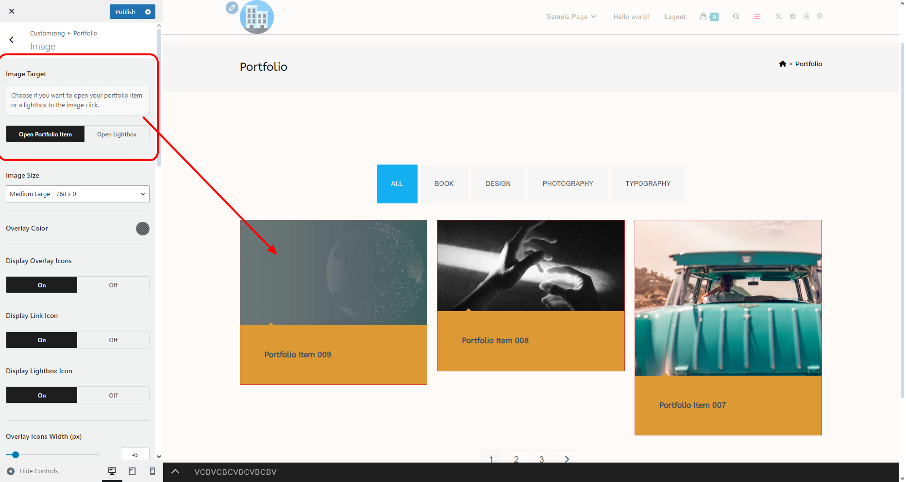
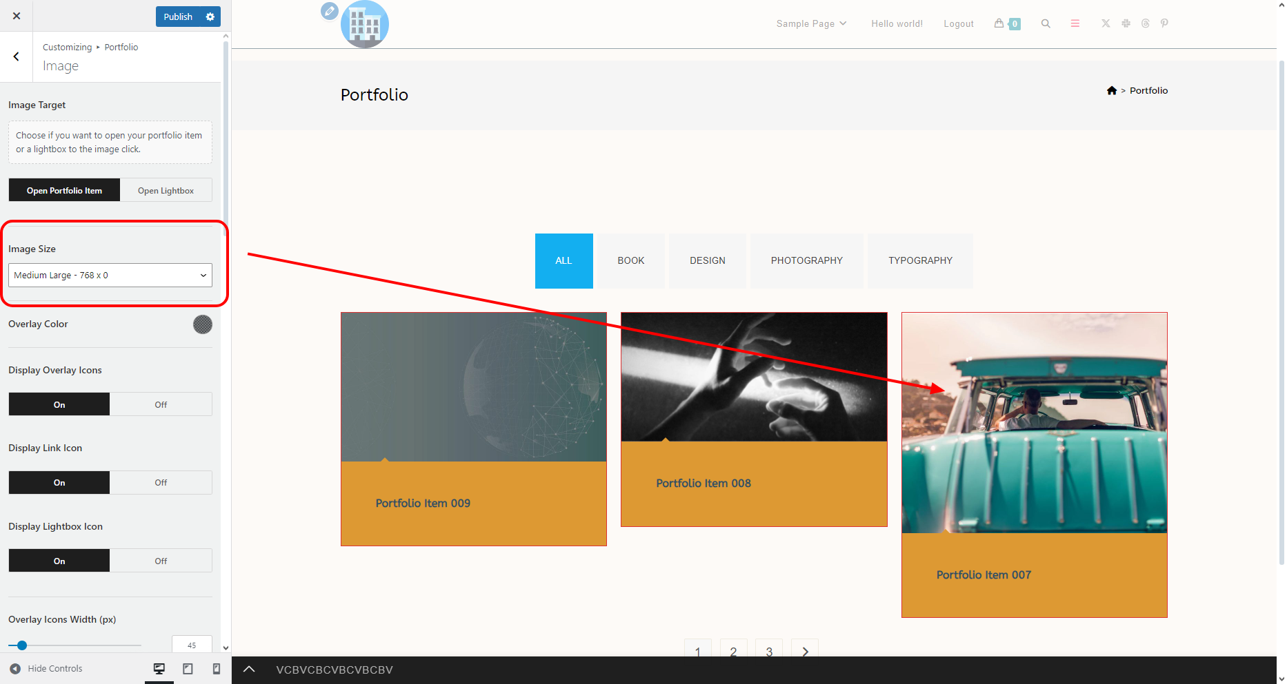
Image Size
The Image Size option enables you to choose the preferred image size for portfolio items.
To avoid blurry images, especially if you're using images of different size and orientation, we recommend using the Medium Large 768 x 0 option.
Overlay Color
The Overlay Color option enables you to apply the desired overlay color which appears of the portfolio item image on mouse hover.
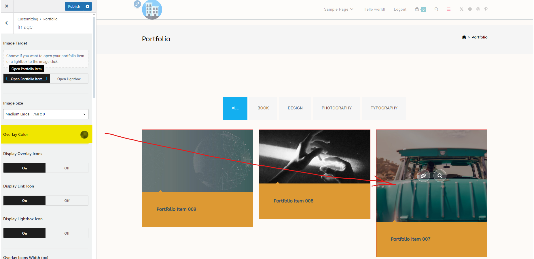
Display Overlay Icons
The Display Overlay Icons option enables you to choose whether or not you want to display the Link (opens single portfolio item) and Magnifying Glass (opens image in lightbox) icons which appear on hover.

Display Link Icon
The Display Link Icon option enables you to choose whether or not you want to display the link icon on hover, which serves to open the individual portfolio item.
Display Lightbox Icon
The Display Lightbox Icon option enables you to choose whether or not you want to display the magnifying glass icon on hover, which serves to open the portfolio item image in lightbox.
Overlay Icons Width (px)
The Overlay Icons Width (px) option enables you to apply a custom width for the link and lightbox icons which appear on portfolio image hover.
This option is always measured in pixels.
Overlay Icons Height (px)
The Overlay Icons Height (px) option enables you to apply a custom height for the link and lightbox icons which appear on portfolio image hover.
This option is always measured in pixels.
Overlay Icons Size (px)
The Overlay Icons Size (px) option enables you to apply a custom size for the link and lightbox icons themselves.
This option is always measured in pixels.
Overlay Icons Background
The Overlay Icons Background color option enables you to apply a regular and hover color to the icons background.
Overlay Icons Color
The Overlay Icons Color option enables you to apply regular and hover color to the icons themselves.
Overlay Icons Border Radius
The Overlay Icons Border Radius option enables you to apply border radius enabling you to display icons as squares, squares with rounded corners, circles, etc.
Add values following CSS rules (top, right, bottom, left). Separate values using space.
Examples:
- 10px: will apply 10px border radius all around - top, right, bottom, left.
- 10px 50px: will apply 10px border radius on top left and bottom right, 50px border radius on the sides, ie. top right and bottom left corner.
- 10px 50px 30px: will apply 10px border radius on the top left, 50px border radius on the sides ie. top right and bottom left, 30px border radius on the bottom right corner.
- 10px 50px 30px 20px: will apply 10px border radius on the top left, 50px border radius on the top right, 30px border radius on the bottom right, and 20px border radius on the bottom left corner.
Overlay Icons Border Width
The Overlay Icons Border Width option enables you to apply border to the overlay icons.
Add values following CSS rules (top, right, bottom, left). Separate values using space.
Examples:
- 1px: will apply 1px border on all sides - top, right, bottom, left.
- 1px 2px: will apply 1px border on top and bottom, 2px on the sides, ie. left and right.
- 1px 2px 3px: will apply 1px border on top, 2px border on the sides, 3px border on the bottom.
- 1px 2px 3px 4px: will apply 1px border on the top, 2px border on the right, 3px border on the bottom, and 4px border on the left.
Overlay Icons Border Style
The Overlay Icons Border Style option enables you to choose the type of the border you want to display, including the option to display no border.
Multiple choices available.
Overlay Icons Border
The Overlay Icons Border color option enables you to apply regular and hover color to the icons border.
Image Animation
The Image Animation option enables you to choose whether or not you want to display an animation on image hover. For example, achieve the Ken Burns effect.
Animation Duration
The Animation Duration option enables you to choose how long will the animation last. For example, 10s if you want it to last 10 seconds.
Animation Delay
The Animation Delay option enables you to choose how much time should pass from the initial hover until the animation begins.
For example, use 2s if you want the delay to be 2 seconds.
Transform Origin (Initial)
The Transform Origin (Initial) option enables you to choose from which position should the animation start.
For example, if you use bottom left the animation will start from the bottom left part of the image.
Learn more about the Transform Origin CSS property.
Transform (Initial)
The Transform (Initial) option enables you to choose how should the animation start.
For example, if you use scale(1.0), it means the animation will start as is, or in plain language, from zero.
Learn more about the Transform CSS property.
Transform Origin (Final)
The Transform Origin (Final) option enables you to choose at which position should the animation end.
For example, if you use top right the animation will end at the top right part of the image.
Learn more about the Transform Origin CSS property.
Transform (Final)
The Transform (Final) option enables you to choose how should the animation end.
For example, if you use scale(1.3), it means the animation will end by enlarging the image up to 1.3 times its size.
Learn more about the Transform CSS property.
Query
The Query panel contains further options that enable you to choose which items to display on the main portfolio page.

Available options include:
- Author: you can choose one or multiple authors of single portfolio items you wish to display on the main portfolio page. Leave blank to display all.
- Categories: you can choose one or multiple portfolio categories you wish to display on the main portfolio page. Leave blank to display portfolio items from all categories.
- Exclude Categories: you can choose one or multiple portfolio categories you wish to exclude from the main portfolio page. Leave blank to display portfolio items from all categories.
- Tags: you can choose one or multiple portfolio tags you wish to display on the main portfolio page. Leave blank to display portfolio items with all tags.
- Offset: choose a number of individual portfolio items to be skipped, ie. not be displayed. Using this option breaks pagination, therefore use only if you're displaying all items or not displaying pagination.
- Order by: option that enables you to sort main portfolio page items based on your query. Multiple choices available (date, author, ID, etc).
- Order: option to choose whether to display portfolio items in an ascending or a descending order.

Single Portfolio Item
The Single Portfolio Item panel contains options that enable you to choose the general page layout, choose which elements to display and in which order (loop builder), as well as various other options.
The Single Portfolio Item options function in the exact same manner as the Single Blog Post item options.
Until this page is complete, see options for the Single Blog Post item.
Styling and Typography
The Styling and Typography panel enables you to apply typography, color and various other settings.
This part is currently being edited.
Found an error in this doc or believe it needs improvement?
Send us a prepurchase ticket, include the URL of the page, and add suggestions and more details about how we can make things better for you.
That's it!
Enjoy building your WordPress website with OceanWP!